*Review* 3AA Membership pack/F-Legion

INTRO

And so it came to pass that in the latter months of 2011, a membership was purchased. This membership offered a prayer of discounted toys and exclusive releases. Verily, as 2012 wore on, the faithful grew restless and sore afraid that their membership might naught appear before year end or worse, 2013.

Hark brethren! I bring good tidings of great joy! The 3AA Membership has arrived and heralds with it a mighty host of geeky goodies!

PACKAGING

What is this packaging you speak of? Essentially, the 3AA pack IS the packaging. It shows up in your standard issue 3A brown box, but inside there’s no artwork, no real “packaging” at all. Just the messenger bag wrapped in plastic with everything else stuffed inside.

WHAT’S INCLUDED

The first and most important item included with the 3AA pack, isn’t an item at all but the 15% discount you get on each and every purchase you make at bambaland. If you’re a member for 2012 (and have had any interest in the drops thus far) you’ve been enjoying that as well as a sprinkle of 3AA exclusives for about six months now.

The excess includes a messenger/laptop bag, baseball cap, membership card and 3AA’s first 1/6 offering, F-Legion.

THE BREAKDOWN

I’m going to start with the “extras” before I talk about F-Legion. For some, all this stuff is “extra” and the membership is all about the year long 15% discount and the 3AA exclusives you have access to. For me, it’s about the discount/exclusives AND the included 3AA figure. The rest of this stuff is the extra sauce that some will savor, some will spit out. The laptop bag surprised me. I’d heard many a negative rumble about it weeks before I’d even gotten mine in so I had very low expectations. I heard everything from it being “too small” to “cheaply made” to simply being “crap”.

Maybe I’m alone, but I like it. Don’t shoot me.

I’ll just address the three common complaints directly. Too small? Really? What the heck are you carting around crazy people? I can easily fit my wife’s larger, clunkier, older 15 inch macbook pro and it’s charger. I’ve also put in there a Wacom tablet, standard sketchbook, an iPad, a couple of backup drives and some light reading material. Even with a Zomb tossed in, I still have room for extra chargers and a PSP or Vita if I felt so inclined. All you peeps with 17′ plus laptops need not apply.. but come on, “too small”? I simply can’t agree with that.

“Cheaply made”. I’m no laptop bag connoisseur, but I’ve had my share of good and bad bags. Currently I have a really lovely hand made leather bag that will only fit the bare essentials as well as a tried and true (though currently at the forefront of falling apart) booq bag I got a few years back. The 3AA bag isn’t made of kevlar, but it seems to be of the normal kind of quality that you’d find on low to mid range bags at your local Best Buy. There’s large clips on straps and velcro inside to safely secure your laptop as well as a few extra zipper pockets to hide your stuff. The 3AA logo adorns the inside of the flap which some will dig if you’re down with the font choice. I think it looks nice enough. Two faux iron on patches decorate the front flap. Both make stabs at accurately portraying Mr Woods sketchy art style and do so well enough. However, you might shield your children and grandmother’s eyes if you fear they’ll be shocked by what looks like an eight year old’s rendition of a topless buxom babe.

So yeah! I think the bag’s cool. Useful even! I’ll probably even carry it around SDCC this year since my booq is failing me.

Le’ hat on the other hand…

It’s not that the cap is all that terrible or anything, it’s just that it strongly favors those with tiny heads. It’s fitted (not elastic) so there’s zero wiggle room. It will either fit you or it won’t. Most likely it won’t.
I haven’t sported a ball cap in years. It’s just not my jam/style. So even if it fitted me perfectly, it’d wind up in the back of the closet collecting dust.
I suggest you just give it to your kid or the neighbor’s and call it.

Honestly, this is what I’d consider the most useless piece of the whole kit: the membership card. It is cool that it has some nice Ash artwork on the front as well as your name and member number pressed into it. I guess there’s a sense of “now it’s official” but the actual real world usefulness is nil since you’ve already been experiencing the benefits of being a 3AA member for the past 6 months without it. For those that trip out over getting theirs year after year, I can only assume it’s a little like slowly building a collection of annually released baseball cards. Next year you’ll have 5!

Now we come to the meat and potatoes of the pack, F-Legion. The name for our friendly neighborhood 3AA fig comes from a rather sorted past. Some say it was A. Wood’s response to “haters” on other forums, people questioning his work ethic, personality or quality of his toy line. Others have said that it came from a misunderstanding concerning a Facebook based ThreeA BST page, where Wood thought his newly dropped toys were being bought and flipped for 3 times their original price. Many have taken some small amount of offense to it, believing that it’s essentially an “F you!” to the opinionated and dedicated fans who helped make Wood the success story he is. On the other hand, it could just be an obscure unrelated nod to the ever growing “3A Legion”.

I don’t know what to believe nor do I really care. F-Legion is here regardless of the why or the inspiration behind his existence. And as it turns out, he’s actually an alright dude.

When you first open F-L up, he’s zipped up head to toe with a hoody and balaclava on. From the initial preview pics I was really excited for the balaclava simply because it looked sorta Batman or Casey Jones cool. A crime fighter in a street thug mask. I dug it. The execution of it is terrible though. The eyeholes don’t line up at all and the zipper forms some sort of odd mohawk like shape over his dome.

To top it off, it’s sewn to his jacket. So whether you have F-Legion dawning it or not, you’re stuck with it. It’s a pretty odd/lame move on 3A’s part. In it’s own way it’s still an alright accessory. Pose him with his jacket hood up and over it looks appropriately menacing as long as you don’t’ pay too much attention to the uneven eye holes. Have him zipping it up or down looks pretty cool as well. So there’s stuff you can do with it though worn as intended just looks silly.

You can tuck it up under the hood of the jacket or even roll it back and down behind his back with a little work. That way it’ll become quickly out of sight and kinda out of mind. Just be careful with it. Mine started to fray and come apart at the seams immediately. Literally. It’s cheap, ie poorly made.

We don’t need no stupid odd shaped balaclava anyhoo, F-Legion’s face sculpt is awesome! I absolutely love the menacing little dot eyes and the simple, carved robotic grooves that run down the sides of his head. The tight lipped overbite and clenched jaw make him look like he’s all business, ready to kick some serious Zomb butt. The dark hue of his robo-skin looks really nice too. There’s just the right amount of weathering to give you the sense that you’re looking at something made of metal.

Of course by being robot in origin, F-Legion also is the beneficiary of the same fantastically fun hands that have been a part of 3A toys since almost the beginning. Much like the super sweet/superior Jungle Vet (review here) before him, the amount of character the articulated fingers give F-Legion is difficult to measure. I just put a bunch of gold star stickers all over the place to show support!

Moving on to what covers his would-be naked robo-butt. My man has a newly fashioned jacket with an afore mentioned hoody (and by proxy, annoyingly attached baklava). I really like the way it looks. For some reason it reminds me of a dock worker or something someone working on a ship would wear, so we took a bunch of these pictures on the docks.Where the real intrigue and “hmmmm”s come in for me, is that when the thing is all zipped up F-Legion looks a lot like Bamba-lad, an Ashley Wood character that’s been around as long as I can remember. Bambas have been released since year one from 3A but none have been (very) articulated and that’s something a lot of us have been pining for.

pic credit: ThreeA

In short, the whole deal makes me wonder if Ash/3A have a fully articulated version of the character in the works at some level. It’s all blind speculation, but here’s to hoping! At the very least I can bet we’ll see some talented customizers give the idea a spin.


So the jacket looks rad, but the zipper on it sucks. Much like you’re stuck with the annoyingly sewn in baklava, you also can’t unzip the jacket all the way. Well, you can, just know that if you do, it’s no easy task to rezip. 3A, in their infinite wisdom didn’t include the crucial little part that keeps the zipper from going off the end of it’s track. Heed my words, “DON’T UNZIP THE JACKET ALL THE WAY!”

Another problem with the jacket is the massive pieces of stiff velcro flaps that jut out the sides of his collar. Aesthetically they look terrible. One side has a cloth covering so it looks fairly natural, but the other side is just a big rectangle of velcro. I wish 3A had just used a little snap or something instead because much like a pair of Walmart khakis, obvious velcro just cheapens anything it touches. I tuck the velcro side in for display which helps a little.

As you can see, FL doesn’t have a the obligatory 3A tee that most figures have under their jackets, boilers or hoodies. Instead you get a bare chested decal, ala superman insignia. It works alright with this particular figure because why would a humanoid robot need anything more than the most basic articles of clothing to blend in with everyone else? Still, combine the fact that the jacket isn’t made to be unzipped all the way or taken off with the total lack of an under shirt and it becomes pretty easy to see that the entire figure is the result of character design carefully balanced with cost cutting.

That’s not necessarily a bad thing by the by, it’s just the reality of it.

A cool feature of F’s jacket is the built in holster loops on his back for holding his zomb brain busting baseball bat. I’m not sure how practical it is or even how he’d actually access it, but it sure looks cool.

At first, F-Legion’s jeans were the best we’d ever seen from 3A! They’re fitted enough to look modern, yet loose enough to allow for a ton of movement.  The wear on them looks really believable as well. Things stay pretty sexy right up until you lift F’s jacket and reveal that these things are actually TJ Max mom-jeans in disguise. Who’d-a-thought a BA robot like F-Legion shopped at discount women’s clothing stores.

Keep the jacket DOWN and we’re back to being cool.

The new kicks F-L comes with are super nice! While other Adventure Kartel figs sport chuck tailors or doc martins, F-L gets a pair of vans-esque foot gear. It’s always cool to see some more variety come to 3A’s figures. The detail and sculpt of the shoes are really nice! Also for what I believe is the first time ever, 3A actually painted the laces separately from the rest of the shoe.

F-Legion comes with a baseball bat to contribute to all things Zomb bashing related. It’s yet another brand spanking new piece of kit you get with your 3AA exclusive figure.

While It’s definitely a cool accessory for your zomb thwacking army to have, I wish I liked the actual piece as much as I did the idea behind it. The bat “works” for the most part as it looks like a bat, albeit a rather chubby one and F-Legion looks cool swinging it around.

The part that bugs me is that it’s not nearly as refined as it could be. It’s basically a tan piece of plastic with some quick weathering dabbed on. There’s an incredibly visible seam that runs the length of it which makes the whole joint scream “whiffle bat”. If they’d put just a little extra work into it and added some grip tape or possibly a decal, it would have made a world of difference.

Before you go calling me a “stickler “or something that means “unnecessarily picky”, please know that I’ve been slightly spoiled by the fantastic custom work of my buddy Simon (aka. Goatbot) who’s fantastic custom 3A bats have been rocking the scene for several years now. Check his workshop tutorial here if you missed it. He made this bat for me and named it after my wife, which I thought was a fancy touch. It may be cleaner than F-Legion’s, but it’s much more accurately tooled and a heck of a lot bloodier! At the very least his custom piece has shown me that it all comes down to character and while good enough for government work, F’s bat lacks it completely.

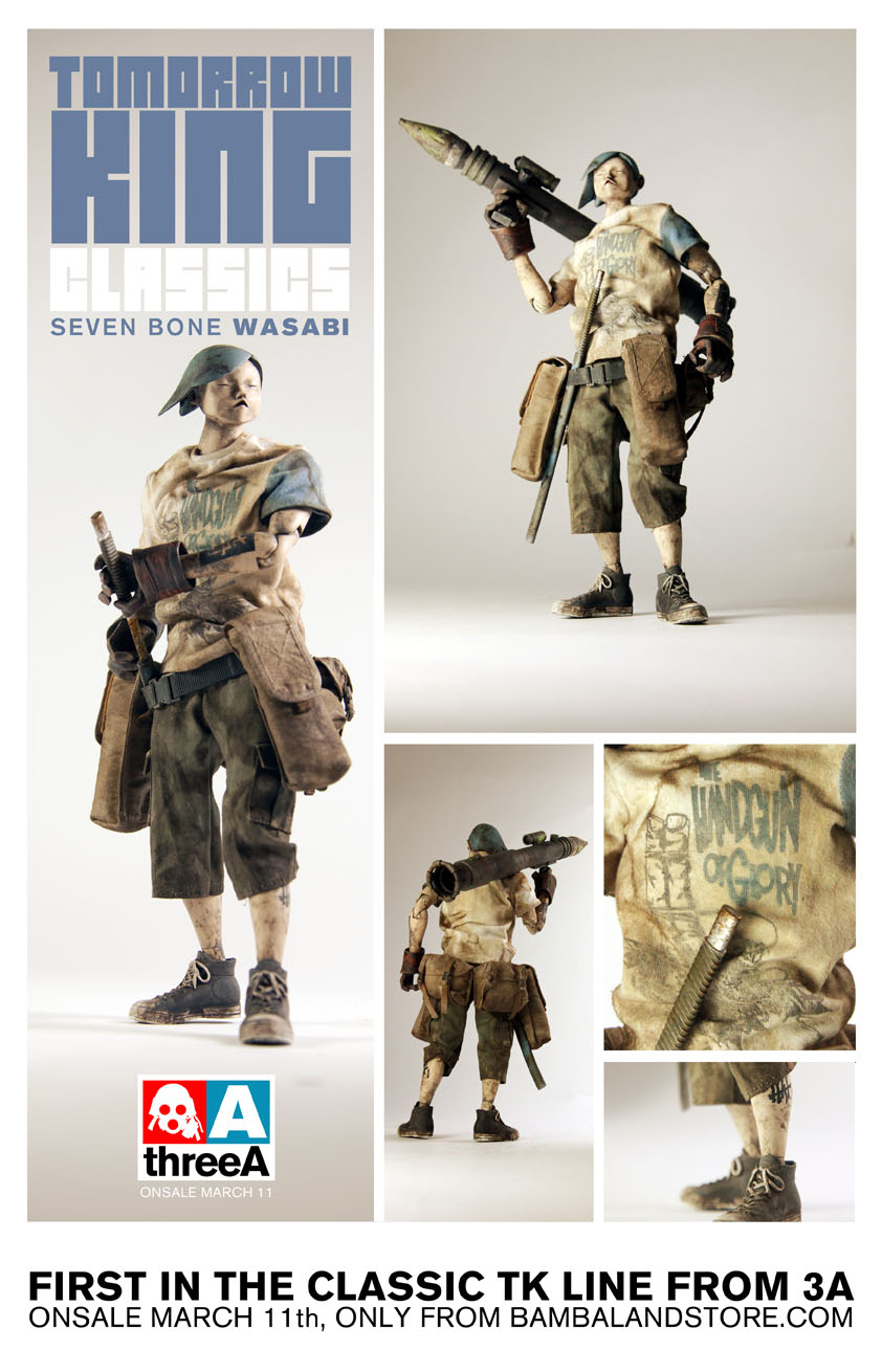
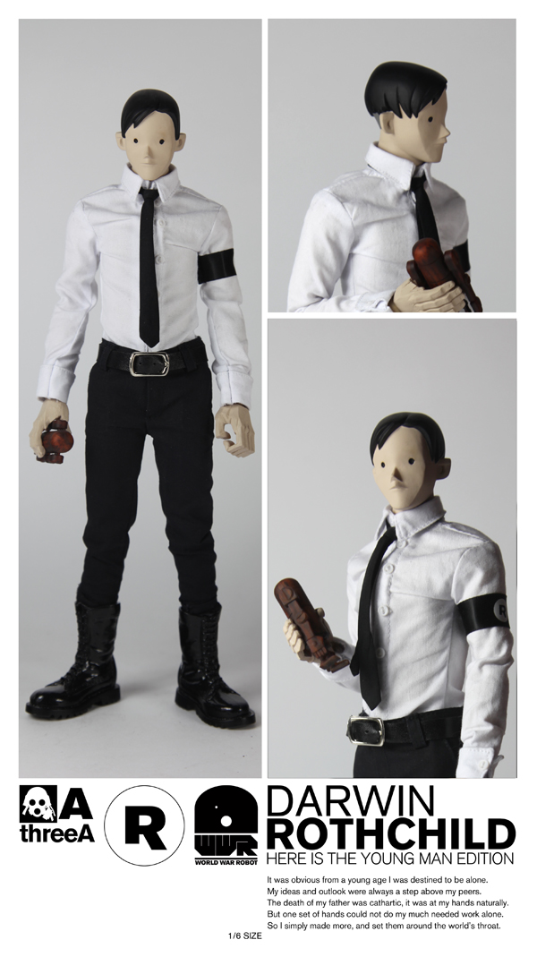
The new slim body has been pretty popular of late. The RVHK Tomorrow Kings (review here) and Rothchild (review here) both use it and F-Legion is no different. There’s not a ton to say further about it other than you get to enjoy a very wide range of articulation thanks to it and F’s forgiving attire. It works well with the figure.

FINAL WORD

So there it is, the 2012 3AA membership pack. All laid out in exhaustive detail. It would have been awesome if we had gotten this thing a little earlier in 2012 but I try to think of it as a mid year reward for patience pack. The past two years that I’ve been a 3AA member have been incredibly worth it. The amount of monies the discount has saved me on purchases easily paid for itself. These extras are about the only thing I feel warrant a debate of value at all. The opinion of the computer bag is split. I found it to be “useful” as it fits all my stuff just fine. Others, whom I can only assume are made up of people who mistakenly consider a 17 + inch, water cooled laptop “portable”, have called the bag “too small” and “complete trash”. To each their own. The ball cap falls in the same ball park, if you’ll excuse the pun. I wouldn’t wear it regardless of if it fit my large-ish noggin or not. It’s just not my style. Others might have really enjoyed adding another wearable brim to their entourage.

Regardless of which side of the fence you fall on or how much better you wish they were, let’s be honest, they’re not WHY you bought the membership.

F-Legion is incredibly close to being a classic 3A figure. He hits a ton of the right notes but misses the mark completely on so many others. Like something that’s only beautiful from afar. I ended up really liking him, but only when I didn’t look at him too close..

You’re stuck with the bakaclava since it’s sewn in. You certainly don’t want to unzip the jacket all the way unless you want to struggle for a stupid amount of time rezipping it. By minding that precaution, you’re stuck with the jacket as well. Even if you didn’t care about the jacket ever zipping up again, to tear it off would mean to expose the terrible mom jean tops which F-Legion tries to hide as any decent person who conceals that kind of shame.

As I played around with F-Legion I started to feel like I had to experience the figure as Ashley Wood or 3A intended me to experience the figure instead of how I’d preferred to. It’s a strange thing to say about a toy, particularly one you can move around and change so much, but . Could artistic design which attempts to force user perspective truly be at work here?

Maybe it’s not that grand. Maybe it’s just easier and cheaper to make a toy without fully functioning zippers, weird mom jeans and sewn in partially realized crappy masks. Maybe it’s as simple as that.

Maybe.

F-Legion is a mix of a little old, but mostly new. A blend of a few finely crafted pieces and a couple of half-assed shoddily spit up bits. Like a 4 cylinder engine in a corvette. It’s still cool looking, light and peppy, but there’s so much “why would they do that?” going on it’s impossible to love.

Pros:

  • The new head sculpt is SICK!
  • Once again we get awesome robot hands
  • His overall design works really well
  • Awesome new shoes
  • The jacket is MOSTLY a good thing
  • The jeans MOSTLY rock
  • Another unique and fun Adventure Kartel figure

Cons:

  • The bakaclava is terrible. Mismatched eyeholes and cheaply sewn
  • It’s also sewn to the jacket, which knocks the jackets cool factor down a couple slots
  • The jackets non fully functioning zipper
  • ugh, mom jean tops
  • baseball bat could have been better
 

Help us improve this site by letting us know what you think! Follow us on Facebook and Twitter to stay updated on all the latest reviews, previews and toy news!

/

/

/

/

/

/

/

/

*Review* 3A’s Darwin Rothchild Father and Son Two Pack

INTRO

In Ashley Wood’s World War Robot, Rothchild is the evil/indifferent/ingenious inventor who individually from very little created all the various warring robot factions. He sells to the top bidder, North or South, Earth or Space with complete ambivalence. He also supposedly thinks of his creations as his own children. In fact, on the box for the Father Son Two pack it reads that he “looks upon 003 as a father does his child.” A man’s love for his murderous giant robot, truly heart warming stuff.

The idea behind this pack was pretty awesome. You get the creator.. nay, stirrer-upper of trouble that is Roth as well as his sleek assassin/bodygaurd, the shiny red 003. My anticipation for this set was rivaled only by the Blind Cowboy/Ghost Horse Super Set I received earlier this year. (See review here) I knew from the day I placed the order that Rothchild and 003 would be very clean and in stark contrast to the usual grit 3A dry rubs their stuff in. I was ready for it. In fact, believed it to be a boon for my collection in the way they’d stand out on the shelf. The Caesar release was the first from 3A’s new LUX line which was to be essentially their premium product. I read that to mean, “it doesn’t get any better than this so hold onto your butts.”

Therein lies my confliction with the set and in fact the underlining for this entire review. How can something meant to be so pristine and so polished, feel so freaking sloppy?

PACKAGING

The 2 pack arrives in a sturdy, large brown box as is most often the case when 3A makes a house call. The box art itself is minimalistic front and back. It features contrasty red and white with various logos sprinkled about. It’s primarily a focus on basic form and negative space. Ergo, not a lot to see here.

WHAT’S INCLUDED

So you managed to wrestle your set free! Congrats! The big red bloke 003 has two sheathed (and sick looking) blades as well as holstered twin pistols. Darwin comes with a swap of hands and a tiny “wood” bertie. Also included is a catalog of sorts, showing offall the 3A toys you missed out on over the past year or so.

THE BREAKDOWN

My Grandma had a weird saying, “there’s those who dig graves and those who wouldn’t be caught dead doing such.” I think it was meant to be a funny way of looking at people who work hard and people who don’t… or it was just Grandma being morbid. Well, straight out of the box, Rothy looks like someone who wouldn’t be caught dead doing such. Super clean head to toe. Not a spec of 3A grime or gristle on him. Right after the Rothchild drop, 3A teased a few pics of a couple of Roth variants, an all black version and a dirtied up version that look like he’d been changing the oil on an old bronco. I know I said I was ready for clean.. but I can’t help but wish dirty mechanic Roth was a regular release as well.. I digress.

Rothchild has an interesting head sculpt. It’s extremely simple and expressionless. My first reaction to the teaser shots could be summed up with a massive “meh”. However, now that I actually have him in hand, I actually really like the sculpt. It works really well for the character. His youthful, blank stare somehow screams a dark ambition.. or perhaps contemplative resolve. He could just as well be saying, “you did well today my son.” or “I’m afraid I have to end you.” Maybe that’s why it works. It leaves a lot up to your interpretation in ways a sculpted smile, frown, smirk etc type of expression would not.

The hands Rothchild comes with are all slight variations of each other. One wider than the rest to easily hold the wooden Bertie and one in a sort of, arthritic, knuckled position which reminds me of Tommy Mission’s ham fists. The problem I have with the hands is they all look a little on the cheap side. Maybe it’s the total lack of weathering or paint detail but they look like they were simply cast and tossed in the box to ship. It’s odd because the hands ARE painted. Someone actually took the time to dip them or run a brush over them but there’s no details (fingernails, etc) at all. The sculpts are actually really cool, but in the end it comes across flat without different tones or highlights to set them off. Also, all of the hands in my set have very VERY visible seams which heavily contributed to their over all cheap-ish appearance. I did like that they’re made of a softer material than previous 3A figures have been equipped with. This is cool for fitting things into his hands with little effort, like a the wee Bertie or maybe even a weapon of some sort.

Speaking of the wee Bertie, it’s painted a sort of faux wood color. It does the job but is an obvious no frills effort at realism. Still, mini Berties are cool. It is known.

Roth has some Hot Topic-esque goth rubber boots that look kinda cool, if only from a distance. This was the one detail that I was the most interested in from the teaser pics. As it turns out, I found them sadly lacking. On one hand, due to the large sole of the shoes, you should have no problem getting Darwin to balance upright. On the other hand, thanks to the rubbery like material of them, they will not allow for any sustained ankle or foot articulation. Want to bend Roth’s foot up or down? Not a problem. Want it to stay there? Not going to happen. The ankle peg just isn’t stiff enough to resist the rubber of the boots. It’s odd, because even with Blind Cowboy and his incredibly hard boots I can get his ankles to bend and stay. I chalk it up to the nature of the rubbery material which is somehow neither soft nor hard enough to work.

Now we come to Rothchild’s wardrobe. This is where all my frustrations with this figure start to come to a boil. Roth features the newish 3A slim body which I’m a pretty big fan of. His clothes are sewn to be more fitted and “neat”, so therefore are more snug than most of 3A’s previous offerings. Ah.. frustration. Where to begin? The pants are nicely tailored but at the waist they sort of “U”up which gives him the look of someone who was on the unfortunate losing end of an all day brutal bout of Team Sport Wedgie. There is also no fastener of any kind where one’s zipper should normally be. Any sitting position you put Roth in parts the crotch of his pants wide open which neatly displays his Ken doll like goodies in true Basic Instinct fashion. It’s a strange omission considering the peeps in charge obviously have ample amounts of sturdy Velcro strips laying around.

Don’t get me started about the belt. I think I’ve seen a better looking accessory included with Beach Barbie. No seriously, her beach ball was super realistic! Well done Mattel, full marks! Anyway, the belt looks cheap, like a spare strip of pleather that was cut by a 10 year old. (Hmmm, these are made in China right?) The belt buckle isn’t doing much to help either. Overall, the whole get up is very cheap looking.

It’s Roth’s shirt that is the true bane of my toy collecting existence. Once again 3A decided to use a solid, wide, stiff strip of velcro, running chin to groin as the primary way of keeping his “button up” shut. As was the case with Blind Cowboy, this causes his shirt to bunch up in the front and sit stiffly. It’s impossible to get it to rest naturally. While BC shared this flaw in design, his shirt was at least loose and forgiving making it fairly easy to adjust with some determination. Rothchild’s shirt is form fitted to his slim body. There is no wiggle room here and no way to work around it. What you see is what you get.

On the plus side, the sleeves are fitted really nicely, giving you all the room you need to move his arms around. Unfortunately they’re buttoned (sewn) shut so there’s not a good way to roll them up if you felt so inclined.

Personal mileage may vary but in my case, just look at that mess of a tie. Crinkled, creased, and stuck in some degree of wind blown. The easiest thing for me to do would be to untie it, gently iron it and retie it. I’d do that, but 3A super glued the tie to his collar which has forced me to hunt down a tiny iron. The search continues.

We’ve talked about how Roth looks and dresses, but how does the man dance? Not too well it turns out. Thanks to the new slim body, Roth has a ton articulation at his disposal, you just can’t really access any of it on account of his unforgiving attire. Not that I expect too many will have him pulling off Van Damme split kicks or the like, but Roth’s cloths bind him up pretty well limiting his motion to about 40% of what it could be. Still, you may be surprised by how much character you can squeeze out of Roth, even when the majority of your poses will come from his arms and a twist of his neck. Anything beyond that is a royal pain.

So now we move on to Rothchild’s looming sidekick, 003. Man, how I wanted to love this guy. I’m a big fan of the clean, shiny Nightwatch colorway with my MK3 Bertie being among the favorites in my collection. Ash dirtied up Nightwatch and Daywatch when the Heavy Bramble versions hit and I lost interest. Then along came 001 and 002 Caesars, two paint jobs that mimicked the clean shiny look of DW and NW of old. While I didn’t pull the trigger on either of them (hindsight, they look amazing). I sprang on 003 believing fully that I’d be dealing with a glossy, beautifully clean, stark RED bot charged with rocking my entire collection with his awesomeness.

Let me start with what I like about 003.

At first glance, 003 is striking. He’s huge, towers over Rothchild and the red absolutely pops! The one armed shield looks awesome on him and all the black painted accents and white decals truly look fantastic. If you don’t like clean bots, he may not do anything for you. For me, I enjoy the variety of mixing the war-torn with the fresh off the factory floor.

The twin pistols and knives 003 look great. The guns have red grips while the knives have a really slick contrast to them. 3A calls the knife a “harmonic blade” and they knocked the design of it out of the park. I wish I could own one in 1:1 scale (Make it happen Ash!).  Some will mix and match, but for me the best look is dual anything.

Caesar has some really great articulation. I’m gigantically relieved of this. Up until now, the 1/6 dropcloths have sported the best bot articulation in the business with their ability to move incredibly similar to their 1/6 human counterparts. While not groundbreaking, Caesar does upgrade things in a few areas that makes them a tad more versatile. For one, the range of movement on their shoulders is a good deal broader thanks to a larger double ball joint. Caesar borrows from Popbot and puts a mid foot joint in for some more flexablity.

The last thing I noticed is the thumb joint is on a simple, nice to use ball joint that easily rotates around to whatever angle you please. You can also FINALLY lay the thumb almost completely flat against the palm of his hand. No more perma-thumbs up!

If I was to say one negative thing about “playing” with Caesars, it’d be that they’re a little big. Negative isn’t really the term I’m looking for, but unlike the Dropcloth who ring in just at 12 inches tall, Caesar hits the high notes of 16. The difference is pretty dramatic really. DCs you can grab off the shelf and mess with while leaning back, ‘laxing on the couch. Caesars are just bulky enough that you need something to sit them on to do the same thing comfortably. I think the recently released 1/12 Caesars may hit that sweet spot for 3A and give us something really special toy wise.

Still, given the relatively small amount of articulation limitations Caesars possess, you’ll definitely enjoy posing these guys up.

Aaaaand, that’s it. We’ve reached the end of the positive stuff. On to the gooey bits!

Someone else on one of the many forums I frequent said it best a day before I’d even had a chance to open up my set. I paraphrase, “003 is the first toy I’ve bought from 3A that actually LOOKS like a toy, like plastic.”

There it is in a nut shell. The promise of a glossy, sleek  and sexy red killing machine fell just short of sexy, sleek and (mostly) glossy. Let me remind you that I’ve collected the Night Watch colorway for a few years now. I’m used to 3A’s “clean” bots. I want to reassure you that “clean” is a non-issue here. The issue lies in how the red color of 003 reads.

003’s shield, arms, hands, legs and feet are all painted a nice shiny red color. In direct and indirect light, they maintain a dark but bright red hue that’s nice and shiny. However, there is something about 003’s torso and head that just screams “plastic”. At first, I wasn’t even sure if they were painted red or if it was simply exposed red vinyl. Upon further inspection I noticed a  few paint drips and tiny paint bumps here and there. I believe the problem lies in the material underneath. Where the arms, legs and shield are all a hard plastic, the torso and head are a softer vinyl. This allows light to penetrate the surface, even with a few coats of paint on it. Working in 3D I liken this to subsurface scattering which has everything to do with the absorption and affect of light to a surface. You can see it best in the wax of a burning candle or when there’s light shining behind someones ears or finger tips. This effect keeps 003’s torso from maintaining the same true rich red the rest of his body has which  To my eye, that’s where the illusion of this robot fails.

It’s difficult to photograph, but in hand it’s almost immediately apparent. I’m not sure if I can really blame 3A for this, but I can say that it doesn’t affect the 001/NW or 002/DW colorways. Maybe a better base coat? A few more layers of paint? Perhaps simply a darker, deeper, more crimson red should have been used. I don’t know, but I believe there’s some basic light affect/color theory at work here that should have been tackled on the factory floor before sent out to doorsteps.

The thing is, the oddness with the vinyl-esque look isn’t the part that bothers me the most. Tis his skirt and packs that doth pain me most. In a flat light, florescent bulbed office, the colors all blend fairly seamlessly. The reds hold hands nicely and play hop scotch when no one’s looking. Change the lighting though and wow, that skirt looks ORANGE! Again, difficult to photograph but if you held a red pantone chip up to 003 you’d find that each part of him is just slightly off each other. It’s no more apparent than it is on his packs. I have zero doubts that 3A struggled with trying to get this stuff matched up and it’s definitly close. But it’s a little like seeing a realistic CG face, we’ll call it the uncanny valley of color. When something’s off, even a little, it looks REALLY freaking off.

I make no claims to be a master of dyeing cloth or paint techniques in producing vinyl/plastic so I can’t offer a solution. That’s the beauty about writing a review. It gives you the means to go against the very core of constructive critism. More often than not I can toss out a reason why something is “wrong” without any half way solid ideas on how to get it “right”. I feel I’m guilty of that at this very moment and I wish I could provide a few nuggets that may steer the wayward 3A toy development person on to new and improved practices. I’ve none.

The last bit that’s more of a 3A “leftover” from previous toys than anything new to Caesar is the use of WHITE velcro. So many other toy companies use velcro as a cost saving way to fasten things together, but often it’s either cut smaller than the surrounding material or colored to match as to blend in better. The white velcro peaking out of every pack around his belt cheapens the overall appearance even more. If red was impossible to hunt down, black would have at least looked better. I hope 3A looks into some other velcro options down the line since they seem to LOVE using it whenever they can.

I wouldn’t necessarily call 003’s execution “sloppy” but definitely disappointing. Perhaps my expectations were simply too high. Given the hype and excitement surrounding this release, I don’t know what else to call it.

FINAL WORD

What’s confusing to me about this set is that at first blush it was to be all about neat and clean perfection. Caesars are of 3A’s LUX line and Rothchild is the pinnacle character of Ashley Wood’s World War Robot. Their designs are spot free, simple and by all accounts should hold up to some form of white glove treatment.

Instead, we find so much is swept under the rug or rather, appear rushed. While 003’s mismatched red hues and sometimes visually orange skirt are certainly less than awesome, it’s Rothchild that truly disappoints. Ill fitted clothing further handicapped by a big stiff velcro strip running up the front of his shirt are the tip of his poorly designed iceberg. In my case, I lucked out with one featuring a wrinkled and crooked mess of a tie to boot. His black kicks are basically stubborn rubber goth rain boots that at once allow for tons of ankle movement yet zero ankle poses. A tease letting you know that if they were better designed, you’d be able to do SO much more. In a show of minimalistic fashion mindedness, his belt matches his boots well. Too bad said belt is the cheapest looking accessory I’ve ever seen on a 3A toy. For once, I think 3A should take a few notes from Hot Toys and learn how to properly taylor some clothing. 3A needs to step up if they want to hold up.

If it sounds like I’m being overly negative.. I may be. I have to stress how much I was anticipating this set. I braced myself for some sort of understated, clean elegance when it came to Rothchild and his looming twin blade bearing red beast of a bot.  Darwin’s face sculpt pulled me in much more than I expected. But a great minimalistic head sculpt doesn’t hold up when the rest is such a so close yet so far shamble. I’m honestly a little shocked how 3A could pass him on with a straight face and stiff upper lip as if to say “this is the best we can do.” One would expect more of a forced smile and a weak missed-the-palm-only-got-the-fingers hand shake followed by a brief, “yeeeah, about that…”

I don’t really know what to do with this set. I’m looking at it now from across the room and the two look really good together. But they’re.. Way. Over. There. It’s when you get up close, wet-works style that the illusion vanishes and the flaws leap out at you like a spider monkey.

If you bought this set, I’d really like to hear your thoughts. Maybe I’m too sensitive to it, expecting too much. This set could be 3A’s triple decker burrito to my collection’s glutton free digestive system. While the end result for me is something akin to diarrhea, it may not bother you in the least, in fact you may find it amazingly tasty. I really want to know.

As it stands, Darwin Rothchild Father and Son Two Pack is one of the few and definitely the biggest let downs I’ve experienced from 3A. I hate when things turn out this way.. I guess even more the reason to cry out when they do.

Pros:

  • Rothchild’s simplistic head sculpt has something very cool, yet subtle going on that I really dig.
  • Caesars in general have great articulation and are very versatile and fun to pose
  • The twin knives are simply beast
  • General layout of the color and decal design on 003 is nice
  • Mini Berties are cool
  • (File this under, “not sure it counts”) From a distance, they look great as a set. Maybe you have a high shelf to put them on… ?

Cons:

  • Rothchild’s terribly stiff (thanks to that stupidly massive strip of velcro) and unforgiving shirt
  • Rothchild’s incredibly cheap looking belt
  • Rothchild’s skin tight pants that also happen to be sans a much needed zipper
  • Rothchild’s cheapo looking hands with very visible seams
  • Rothchild’s rubber goth boots. Not bad to look at, but not much use either.
  • Ugh, white velcro on everything
  • 003 has some very uneven red hues going on
  • he’s also overly toy or plastic/vinyl looking
  • 003’s skirt and bags change from red to vaguely orange in various lights
  • slapdash wood paint job on min bertie
  • This is LUX?

Help us improve this site by letting us know what you think! Follow us on Facebook and Twitter to stay updated on all the latest reviews, previews and toy news!

/

/

/

/

/

/

/

/

*REVIEW* 3A Queenie of 7 Bones

INTRO

Up until about eight months ago or so, I wasn’t into PopBot. I really didn’t know anything about it, and of all the 3A toy lines, it was the last wall of my personal resistance. Last year, I decided to get PopBot: Big Beautiful Book from IDW as well as a cool sketch in it from Wood himself. When I got that puppy home I dove head first into the hardcover beast. The world of Ashley Wood’s Popbot is a convoluted, confusing mind screw coupled with gorgeous paintings and sketches. My hope was that I’d develop some sort of appreciation and attachment to its characters. I told myself that if I’d take the time to read and re-read the massive catacomb-like storyline,  I’d glean a bit of real understanding and background of the dramatically illustrated world.

Nope. No idea. None what-so-evah. There’s something in there about a talking cat that sings and sleeps with robot hookers, some robots who want him dead, a blind cowboy that shoots his teeth, Sherlock Holmes waxes wise, Lady Sham is chatting it up with the devil in the wastelands, more robots, a few salt and pepper shake’s worth of Tomorrow Kings, Andy Warhol has his own talk show where he keeps interviewing some rapper dude who keeps killing him… I don’t know. The saga continues, I guess?

The Popbot world is as big, varied and fascinating as it is confusing, silly and unorthodox.  The only thing I took away from reading the Popbot collection other than an even further appreciation for Ash’s skilled brush is that I now have the general knowledge that those characters and their vague stories exist.

But that’s the odd thing. Now that I have that, it somehow manages to be enough to make my ears perk up and my F5’n finger twitchy anytime 3A announces a new Popbot figure. I’m hooked on PopBot. 3A has to be lacing them with something.

Which brings me to 7 Bones, another expansion of the PopBot world. The 3A wiki says, “Seven Bones, stylized “7bones,” is a group of rogue Tomorrow Kings in the Popbot Universe who are the personal guard of Punk King.” 3A has been slowly releasing them over the course of the past year. So far we’ve seen Wasabi, Kyoku and Queenie. Wasabi has been setting the vibe on our shelves since 2011. Kyoku was next in line sales-wise, but due to a production delay, Queenie was actually shipped out first.

So now that all that intro huffa-puff is out of the way, on to talking about Queenie. Read on to learn more about one of the most exciting figures to come out from 3A this year!

PACKAGING

As you can see, Queenie gets the packaging treatment she deserves with a nice painting of her looking stoic on the front. On the back things get traditionally 3A graphic design-y. It’s a nice contrast, shelf worthy for sure.

WHAT’S INCLUDED

Queenie has a tiny array of stuff to fiddle with. Equipped with a staff (a first for any 3A toy!) and a couple of interchangeable hands, she was triple clam shelled together and took a little work to get out. A few spare pegs are included as well.

Also I’m happy to report she comes with a fantastic poster of the cover art with a mini comic on the back. I’m unhappy to report that it appears a blind monkey packed my poster. Instead of neatly folded as they’ve always been in the past, mine came loosely bent together and crinkled. There’s even a few small wear holes where the folds come together. Bummer.

THE BREAKDOWN

The second I got Queenie out of her plastic prison I was sold on her character. As the leader of 7 Bones, she looks appropriately tough in that unrealistic, super slim tough chick way. Her eye patch gives her an air of mystery, while the subtle smirk on her face gives her a sense of confidence. Other than possibly her belt/packs, all her attire is completely new, never used before on any previous 3A figure. The pants in particular set her apart from any other of 3A’s offerings as they’re almost a faux linen material.

Her staff fits into her hands as perfectly as it should. I want to mention that the staff was straight as an arrow. No warping or bends from bad packaging. Huzzah! The second you get her set up with it, you’ll probably lose track of time for a few, putting her in your favorite Donatello pose. I don’t know about you, but it’s been a while since I’ve had a figure with a bo staff.

Queenie is also the recipient of yet another new female body. Ever since 3A updated the tried and true Tomorrow Queen bodies of old, they’ve been messing around with the formula, trying to get the best balance of asthetics and articulation. The older Tomorrow Queens were kind of a pain to pose. Not only did they wear skin tight latex, but their long legs made them wobbly and the opposite of sure-footed. They had a mid thigh joint you could twist around, a very limited knee joint and an ankle joint with a round twisting ankle peg to allow for rotation in most directions. With a good deal of futzing, you could pull of something dynamic, but it wasn’t a very organic process.

3A updated that body when they released Lolli last Christmas. All new leg joints, much better knees, a new torso and thinner arms. You can check our review of her here. They came so close to getting it right, but dropped the ball by changing out the round ankle joint for a square peg. You basically have a figure with much more generous articulation in the legs that should promise you better and more dynamic poses.. but it’s hacked off at the knee by the inability to move the ankle around to get a solid flat footing.

So now we have Queenie. 3A kept the double jointed knees of Lolli and brought back the ball ankle joint. Ah.. that wasn’t so hard, now was it?

Queenie is the first female figure that’s just about as fun to play with as any of your TKs or Adventure Kartel gang. Yes, the ankles are still pretty finicky. You have to press the shoe together to grip the ankle peg so you can twist it to the desired angle. But it’s not difficult at all to get her into some really fun stances. With the bo staff in both her hands, it’s incredibly easy to shift her from one cool pose to the next.

The other hands she comes with are more neutral/relaxed variations. I like that they’re slightly different from one another and not symmetrical copies. They’re useless for holding the staff, but they do add some nice variety when you feel like changing things up.

Speaking of not symmetrical, I might as well broach the subject here. One of the main “complaints” of the new 3A female body is the supposed wonky-ness of its.. breasts. Boob-gate, we’ll call it. Well, Queenie is not lacking in the chestal region by any means, and yes, you can tell they’re not lined up perfectly. I’m of two schools of thought here: My first is the fact that in real life, women’s breasts are unsymmetrical. Now, whether or not Ash and 3A designed them this way on purpose to reflect that is simply a matter of personal opinion, but even for a stylized character, Queenie is more realistic and less barbie doll this way. My second feeling on it is.. this is a toy and I’m simply not going to spend more time talking about a toy’s boobs.

Now that we’ve gotten that out of the way, check out that thing dangling between her legs!

Made you look! When the teaser pics of Queenie popped up, I thought the cylindrical thing strapped to her belt was a jar of rice wine or something, like an old drunken monkey kung fu legend of old might carry.  Turns out, it’s a giant EMP bomb. I suppose this makes sense due to all the robots the gang has to take on. Still, a rice wine jug with some XXX would have been cool.

As a member of 7 Bones, it’s only natural that I’d want to put her up with Wasabi. The two look great together, though the blues aren’t exactly spot on. It makes me even more excited about the idea of having all seven positioned together. Which at this rate should be sometime in 2014.. ugh.

So what do we have so far? The new articulation is a marked improvement over any previous female figures. The new head/hand sculpts, accessories and clothing make you comfy in the knowledge that you’re legitimately getting a brand NEW character and not a bunch of reused bits and pieces. There’s a lot to like about Queenie.

There’s also a few things that aren’t so fabulous. I already mentioned boob-gate, but only because there’s been some discussion amongst the ranks about them.  However, they don’t bother me. My first real complaint is the equally discussed misaligned/sized eyepatch strap. If it’s a design choice as some argue, it’s a very odd one that simply doesn’t work. If it’s something 3A somehow missed before finalizing her sculpt, I can only ask the question, “How?”. It’s just a bizarre detail that doesn’t kill the cool factor of the character, but those more OCD than me may have a hard time looking at her from some angles thanks to it.

The other complaint comes back to the articulation in the legs. While they’re vastly improved and easier than ever to play with, once again 3A’s knack for adding while subtracting has somewhat shot themselves in the foot. (So many leg/feet analogies I hardly know what to do with myself!)

When they upgraded the female figure for Lolli, giving her double jointed knees and a more forgiving hip joint, they took away her mid thigh joint and stuck her with a square peg at her ankle. It was an upgrade that was nullified by the downgrades. With Queenie they brought back the round ankle peg, but still left out the mid thigh joint. I feel like this was a bad move, especially for a figure that should be as articulated as possible. Some may argue asthetics, but Queenie’s legs are covered up by pants! I’d start trying to push her into a pose and get about 80% there only to realize that’s as far as it’s going to go. It’s still a jump forward of course, but don’t be surprised when you find yourself thinking, “If only I could twist her leg this way just a tiniest bit, she’d be perfect”.

My last issue falls on the shoulders of 3A QC. Early pics of Queenie revealed some terrible peeling and bubbling of the paint on her chest and stomach. From what I’ve read, it’s pretty rare, like shark bites or plane crashes. My Queenie doesn’t suffer from the same disaster those images portrayed, but she has a few odd paint bumps on her chest that are obviously not meant to go there. My instinct is to scrape them off, but I’m sure that would just start a chain reaction of peeling and heartbreak. I’m waiting to hear back from CS to see what my options are. Issues are bound to pop up from time to time and in my history with 3A, I’ve had next to none, but that doesn’t make the bumps go away.

FINAL THOUGHTS

So yes, Queenie is cool. Despite her unique design, I wasn’t incredibly excited about her arrival after being fairly disappointed with Lolli. Seeing how untouched and neutrally posed I generally keep her on the shelf, the thought of having yet another figure that’s a struggle to balance upright didn’t exactly thrill me. I’m happy to report that she was well worth the wait and in fact exceeded my expectations.

She looks great and is loaded with character. The amount of unique poses you should be able to squeeze out of her should make her a stand out addition to your collection. She balances well, she moves for the most part how you’d expect her to, even her neutral hands add appreciated variety to the package.

Queenie is a positive step forward for 3A. I hope they continue to tweak the female body, refine the articulation some more and do something about the uncertainty of the paint app on their rubber torso. Right now, she’s as good as it gets.

Pros:

  • An all new unique character that will stand out from the rest of your collection
  • New female body with enhanced articulation; a big step forward
  • Tons of character squeezed into her tiny frame

Cons:

  • Wish they’d bring back the thigh swivel joint as her articulation still feels inhibited
  • Her eyepatch band, purposeful or not, is mismatched and just looks off
  • Boob-gate? Nah, but some paint issues.

Help us improve this site by letting us know what you think! Follow us on Facebook and Twitter to stay updated!

.

.

.

.

.

.

.

.

*REVIEW* 3A RVHK Tomorrow King

INTRO

It’s been awhile since I’ve been so excited about getting a figure dropped on my doorstep. 3A’s ReVenture Hong Kong 2012 show held host of quite a few exclusives that only those lucky enough to attend the show could get their greedy little mits on. That is, until the remaining tiny allotment was released on bambaland.com about a week after the show wrapped. I was at a friends house, enjoying a cold beverage and some freshly made salsa when the sale went live. I logged into bamba and waited for the first tid bits to load. I knew it was going to be chaos trying to score ANYTHING and that most likely the thing I wanted most (an Old Guard) would also be the most impossibel to get. Exclusives began to trickle onto bambaland.. so far, no Old Gaurd. Each hit of f5 was another spinning beach ball of 5 minute limbo. Finally, the TK box art popped up. I speedily clicked “add to cart” only to be forced into pumping my brakes hard, treated with yet another loading screen some 8 minutes in length. “Come on, come on, come on.. big money.. BIG money.” I’m sure I was muttering something along those lines. Suddenly the message on the screen caused my heart to sink into my shoes. A “server error, server too busy try again later” screen popped up. Knowing how crazy people would be to score one oof these excluves, I knew it was over, that I’d lost out. I failed to score a Tomorrow King.

Just before I closed my screen, I noticed the URL address still read as if it was on my cart page. I decided to hit refresh instead of the back button to see what would happen. After what seemed yet another eternity of waiting, my cart screen loaded up with the stubborn TK still inside! Stunned, I quickly hit the pay/checkout button and watched with delight as my order processed.

Now he’s finally here, my Old Guard. My Tomorrow King.

PACKAGING

What TK worth his salt hasn’t come in a lovely illustrated box? OG is no different. The front is splashed with a dynamic AW painting with a color coded dot on the top to indicate whether you received the blue, black, red or yellow TK. I got red. On the back has something ripped from Ash’s sketchbook with kitty purring the word “Exclusive” in bold letters! Yup, it’s legit!

WHAT’S INCLUDED

I was hoping for a poster, but I’ll settle on just getting the figure. Sigh. 😉

Brass tax. You get your TK and his single trusty sword.

THE BREAKDOWN

3A’s Tomorrow King isn’t anything new. Many 3A collectors have at least one in their collection tucked away somewhere. There’s the Oyabun, Heavy TK, 7 Bones and Interloper to name the few. There hasn’t been much description of exactly how the Old Guard truly fit into Popbot lore (the storyline Tomorrow Kings originate from). The original Tomorrow Kings are often referred to as the “OGs” (Original Gangsta’s), so it’s fitting that “OG” in this case stands for Old Guard. It’s a nod to the original Tomorrow Kings that are so cherished and desired by 3A collectors the world over. Given the relative difficulty scoring these guys, that desire is likely not to diminish despite their new car smell.

There’s a definitive simple elegance that’s just shy perfection in the design of the Tomorrow King figures. It’s something most people who don’t collect or own one won’t pick up on. Heck, I didn’t really get it until earlier last year when 3A released (and shipped) the first of their 7 Bones TKs, Wasabi. With their clean, not overly fussy design and punk rock meets japanese ninja ethos, I don’t find it all that shocking that many think the TK is THE perfect action figure.

So while I assume the Old Guard is a return to that simple elegance of the original Tomorrow Kings, 3A didn’t simply sew up a new batch of shirts and send these guys on their way. The Old Guard actually has an all new body (One shared by the forthcoming/currently landing on doorsteps, Rothchild). Most noticeable is his slimmer silhouette with narrow shoulders. I’ve read some refer to it as the kid or teenager body. One even called it the Bieber body. I laughed at that. Here you can see standing side by side with Wasabi just how much of a visual difference it makes.

You can also see from the same pic that Old Guard’s tee is much more fitted than Wasabi’s.  I can’t say which I prefer as they both work well for the characters. I may give a slight edge to the new body as it seems to work better visually with the lean, mean fighting machines that TKs are suppose to be. But I like the look of variety between them!

The tee shirt itself is what some may feel is a smidge “porny” while others will claim it simply “art”.. whatever you want to call it.. it’s an image of some sort of visually decapitated women in panties and bandages with her boob hanging out. Honestly, of the four Old Guards it’s not my favorite. I like the red color a lot, but find the design on the black and yellow to be much more in tune with my personal style.

Visually, my RVHK score is a slam dunk. I love the orange hair and red shirt. The paint is nice, clothes run or snag free. The new slim profile looks fantastic. Head to toe, I’m digging the orange headed Bieber. So what else do we have here to mess with? Ah yes, articulation!

At first blush, it’d be easy to believe that the articulation is the same as it’s ever been. Knees and elbows are double jointed, wrist spin and twist (a little loosely for my taste). His torso bends in various places and his ankles have those love them or hate them double ball joints. The hands are the same sculpts we’ve seen for years on Tomorrow Kings. One hand molded for gripping the sheath, the other a little tighter to handle the hilt of the sword. Nothing new there.

Or is there? As much as I think the new slim bodies really enhance the overall look of the Old Guard TKs, I did find one little hiccup in it’s execution. I’d even call it a step backwards. Due to the decrease in torso real-estate, the head/neck has less room to wiggle. The head/neck of the OG’s are not redesigned to compensate for the smaller area at the neck joint. What this has done is prevent as full of a range of movement side to side (ear to shoulder) as previously possible.

In the picture above I’ve pushed both heads sideways as far as they’ll go and I think it’s pretty clear how much of a difference that extra space makes. It was probably not worth the effort/expense to 3A to develop an entirely new neck post just for the Old Guards, but it IS kind of a shame it’s even an issue.  I guess we’re to believe these guys are warrior ninja’s capable of all sorts of insane giant robot crushing acrobatics and limber twisty turny ninja skill.. as long as they don’t have to crane their necks too far.

Maybe they are much older than they look?

Other than that, I only have a few small nagging complaints here and there. The first, I mentioned before is the incredibly loose wrist joints. My Wasabi has had the same helicopter wrists since day one, so it’s not exclusive to the Old Guard. I’m sure some will have a lucky die roll and get perfectly taught wrists that can manage whatever pose you twist them in. My OG needs physical therapy. The other “ugh” I muttered came when I first put his sword in his hand. I realized that the blue wash used to get into the creases of his gloves was still wet! The paint wiped off the sword fine and there was no noticeable smudging on the gloves themselves, but it’s still a nuisance. This isn’t baked goods, we’re don’t need our toys piping hot still smelling of the oven.. the paint should be dry/cured before it hits our hands. Kyuuketsuki anyone?

FINAL THOUGHTS

I’m all about Tomorrow Kings and am thrilled to have one from 3A’s Hong Kong ReVenture in my possession. Though not my first pick, (that would have gone to blue or black) red looks just fantastic. In fact, amongst the blue and neutral tones of my other TKs, he really stands out.

Posing and snapping shots of Tomorrow Kings is always a lot of fun. The strength of their character really blooms when you find the right light, angle and pose. Their faces are practically without expression but sculpted in such a way that they lend themselves to whatever type of mood it is within your imagery that you’re trying to capture.

I wish I could say, “Everyone should go out and buy one of these guys right now at your local Toy Store!” But you and everyone else knows that’s impossible. The ebay prices are silly.. stupid even. I’ve seen more than one of these OGs up for almost a grand. I find that hard to stomach, not only because it’s a freaking toy!! BUT some of the ACTUAL OG Tomorrow Kings aren’t fetching those kind of prices. Unfortunately, the flip factor for these guys is pretty high and ebay is evidence of that. Douche-McGee’s came out by the truckloads to Hong Kong to buy these guys just to flip for extortion level prices. Instead of supporting these layman of the avid toy collector’s bile ducts, reach out to your favorite toy community. Be patient. Something will come up eventually. I doubt you’ll get a hand out and I’m sure you’ll end up paying a good deal more than the 90 stones or whatever these guys were at retail, but I can almost promise you’ll get better results dealing with collectors community than the sultans of ass-hattery on ebay.

The more I’ve played with this guy the more I realize I’ll probably be right there with you, holding my breath, abiding my time and waiting for that WTS post. Daddy needs a black and blue. 🙂

Pros:

  • Classic Tomorrow King design.
  • Fantastic toy to play with and shoot photos of.
  • Great quality and care throughout
  • New slimmer body/silhouette looks fantastic
  • Box Art

Cons:

  • Slim body lessens neck articulation substantially
  • Loose wrists
  • Do to exclusive status, they’re being flipped like there’s no Tomorrow… King. (whamp whamp)

Help us improve this site by letting us know what you think! Follow us on Facebook and Twitter to stay updated!

.

.

.

.

.

.

.

.