*Review* 3A and Valve’s SDCC 2012 Companion Square

INTRO

This may be the shortest review in RtR history. I won’t even call it a review,  it’s more of a “Hey kid, quick peaking in my window!”

I love Valve. Not to sound like the guy who says “I love lamp”, Valve is a game company that makes awesome games. Half Life, Portal, Counterstrike, Left 4 Dead, Team Fortress, etc etc.. Games that I’ve been playing since I was a wee boy. They make magic in a box and I’m a long, long time fan.

When 3A announced their partnership with Valve software, I literally did a back flip over a donkey. Hunting down a donkey in Hawaii is more difficult than it may seem, but the occasion called for and justified it completely.

I imagined how awesome 3A’s version of D.O.G, The Combine or Zombies would be. As cool as Adventure Kartel was, I thought Team Fortress figures would be even cooler. An image of a 1/6 scale Freeman sitting on my desk with his bloody crowbar and “buddy” headcrab came to mind almost instantly.

Whelp! Instead of any of that awesome sauce, 3A’s first offering to us was this guy. A toothy, smiley 1/6 WWR (Portal?) companion square. Basically 3A’s iconic Square with the decals of a companion cube.

Cute.

PACKAGING

A clean white box is the initial home of your companion square. Some nice decal/design work that seamlessly integrates a bit of 3A and Valve’s unique charm

WHAT’S INCLUDED

There’s the little guy! Daaawww… Other than the cutest little square I’ve ever seen.. Yes he IS! Other than bucky here, you also get a card that has codes and what not on the back that supposedly does something awesome somewhere Valve-y.

I admit, I have no clue what it does. I’ll need to load up PORTAL and look into it further.

THE BREAKDOWN

I’ve always preferred the classic stub legged, two eyed squares to the newer long legged, mono eyed ones. I had a.. we’ll call it.. impassioned discussion with a friend about why one is better than the other.. he standing on the opposite side of the fence than me on the subject. His argument was that the stub legs never made any sense in WWR. How are these little guy suppose to be scouts, move quickly, slip behind enemy lines etc? Plus he hated their goofy, cutesy face.

He said, “The longer legs on the MK2’s made a lot more sense for recon. Plus, the monocle eye is far more menacing and creepy.. even with that buck tooth grin.

And there it is. This is a robot with buck teeth. I’ll repeat that, a ROBOT with freak’n buck teeth. Long legs or not, it’s not SUPPOSE to make sense. Why are you trying to make it do something it’s not suppose to do? THAT doesn’t make sense.

To me, aesthetically, these MK1 style squares are cute and perfect just as they are. They’re iconic to 3A and will remain that way long after we’ve all forgotten how ugly and stupid the MK2’s were. Argument won, simply because this is my site. Suck it Garrett!  😉

Honestly, there’s not a ton else to say about this guy. The paint and weathering is of your standard grade A, ThreeA quality and the companion cube likeness is immediately recognizable. The heart shaped decals look like and are where you’d expect them. As an afore mentioned fan of all things Portal, it’s fun to see all the little references such as the “Aperture Science” logo and falling cube warning.

Basically what it’s going to come down to is if you like the MK1 squares or not. Also, are you man (or woman) enough to deal with pink hearts on your toys? If the answer is “yes” than you’ll love this guy.

I’ve gotten a few reports from people saying that theirs has a different decal on the back plate than mine.        I wonder how many variants there are…


FINAL WORD

I know a lot of people were moaning that this was a stupid SDCC publicity stunt and not at all something the fans wanted. Where’s our Gordan Freeman? Where’s our D.O.G? Where’s our Left 4 Dead Zombies? Why isn’t the grooves of the companion cube sculpted into the square instead of just painted on? The list of not-long-for-this-world horse beating goes on..

Look, this was the first thing out of the gate. To me, it’s a handshake. A glimpse meant two give us a good idea that these two companies are joining up and are planning some cool stuff down the line. We’ve seen glimpses already of the incredibly intricate Portal bots on display at 3A’s Reventure. The other SDCC exclusive was from Team Fortress, the Heavy’s “Sandvich”. I think that alone shows we can expect some really unique things to come from this partnership.

And I, for one, am really looking forward to what’s next!

Pros:

  • MK1 Squares are the best Squares
  • The Valve/3A partnership exists!
  • Buckteeth robots are indeed cute
  • The paint/weathering is done very well. Not a quick or sloppy app. in sight!

Cons:

  • SDCC exclusive makes it more difficult for fans to get
  • If you don’t like bucktoothed robots, this guy won’t do anything to change your mind.

Help us improve this site by letting us know what you think! Follow us on Facebook and Twitter to stay updated on all the latest reviews, previews and toy news!

/

/

/

/

/

/

/

/

*Review* IDW’s SDCC 2012 Zomb

INTRO

This year’s SDCC was my first. In previous years, I’d find myself staring and drooling at all the cool exclusives offered at the con. This year I’d actually have a shot at scoring them first hand. The slightly annoying bit is that unlike the past few years, my “want” list was pretty light. A couple prints and two or three toys were all I was after. At the tippy top of that tiny list was publisher IDW’s Zomb from their Ashley Wood created series, Zombies vs Robots.

IDW had a presale a few weeks prior to the con. I was dead asleep when it went live, but through some randomness of chance I woke up in the middle of the night, glanced at my phone and saw the words “SDCC Zombs up for sale!” on my twitter feed. In a half-asleep blur I worked my way through their site and secured my two.

Though blind boxed, the zombs were available in two skin colors with two different colors shirts for a total of 4 different combinations. The boxes themselves were supposed to have a color coded dot on them, but the stickers rubbed off several of the boxes in transit.

The color codes are as follows:

Blue = red shirt, grey skin
Green = white shirt, grey skin
Orange = red shirt, orange skin
White = white shirt, orange skin

(thanks for laying it out dtrain!)

For this review, you might notice my zombs have marker doodles all over their shirts. That’s because I asked Ashley Wood to sketch on them. Rufus Dayglow was standing next to him when he started and used him as a bit of inspiration. Thus the birth of “Rufus Zomb”. On my red shirt zomb he sketched a simple, smiling girl and the words “Fun Girl” underneath.

Like most sketches you’d get from Ash, they’re pretty quick renders and a little on the sloppy side. But I love ’em. Rufus Zomb is da coolest!

PACKAGING

Sweet. That’s what I said when I saw the box art for the first time. ZvR played a huge part in getting me into Ashley Wood’s art (that and his stint on Metal Gear Solid) and the box is smothered with illustrations that call back to that fun comic series.

WHAT’S INCLUDED

3A is apparently making a play to help save the planet by doing away with the toxic plastic bubble shell. Either that or it’s a lot cheaper to wrap toys in torn up bits of cardboard. The Zombs are basically free floating amongst the strips, but the padding works well to keep them safe and snug. The Zombs come accessory/poster/extras free. Just them, you and the room.

THE BREAKDOWN

These are the first Zombs out of 3A (cough, IDW) that actually looks scary. With their pitch black eyes and craggy maw, these are some sinister creatures.

They still have similar stylized hair and the big ears that their Adventure Kartel brothers do, but they feel very different. Far more ferocious. These are the runner Zombs of your horde. Unlike the boiler Zombs who slowly lurk around the shadows, the ZvR Zombs run screaming at you from the alleyway, teeth bared for flesh. The paint app on his head and body are really nice. While the grey skinned Zomb appears grey overall, his skin is mottled with specs of blue, brown and black. In fact, it looks like blue is the base color and the main grey fleshy skin tone is painted over it. Once again, there’s no blood to speak of but the paint is broken up in such a way that it gives off a nice decaying flesh look.

Other than the new head sculpt, most of ZvR Zomb’s getup it borrowed from elsewhere. The slim body is used for the first time on a Zomb which adds to their overall agile appearance. But as expected, it’s the same one we’ve seen on Rothchild and the RVHK TKs. The red chucks (which I really dig) are Tommy Red’s, the cargo’s probably from one TK or another. The hands are actually interesting because they are technically a new sculpt, but we saw them first on Rehel. Thing is, as of this writing, Rehel hasn’t shipped yet. So in some ways, the hands are unique to the zombs and it’s Rehel who’s reusing them.

Whichever came first, the Rehel or the Zomb doesn’t really matter I suppose. The hands sculpts are cool and I doubt these guys, or Rehel will be the last we see of them. The tattered and torn tee-shirts lack the usual front “3A” logo or Ash image. Instead we get a blank front and a brain graphic that reads “brain pie orgy” on the back. That worked out fine for me since I was able to get Ash to doodle in the available space, but I thought it looked a little unfinished before.

I didn’t realize this until posting, but apparently I didn’t get a good shot of the back of his shirt. At this point, I’m too lazy to drag my camera out, pose, light and reshoot him. Thus, I hope you can piece together the general idea between these two images.

I don’t really consider different color shirts much of a variant so I sort of wish I’d gotten on grey skin and one orange skin, just to have one of each. I say that now, but when I was looking at them at SDCC, the orange skinned Zomb was very orange. The orange read more like a “special” colorway like Shadow, Inky or Blanc than something that can naturally stand with the rest of your regular collection.

One big difference between my zombs and any other figure in my collection is the way their joints work… or should I say, sound? Even though I have Rothchild and a RVHK TK who both share the same slim body as these Zombs do, neither of them feel/sound the same.

My Zomb’s joints pop. As if I’m moving tiny gears, there’s incremental clicks at every major joint point. My buddy Scott was the first to notice this. We never got around to opening his to see if they shared the same “feature”, but I’d assume since it applies to both my Zombs that it’s not a unique trait.

I’ve yet to notice any hinderance caused by this, but it’s a little off putting, especially the first time it happened. Popping, creaking or cracking toy joints do not usually mean things are going as you planned.

Popping joints aside, I’ve had a ton of fun with these two in the short time I’ve had them. They pose and balance very well, they look super cool and there’s just enough new on them to make them feel original.

Going over these guy with a fine tooth comb I did notice one thing that seems to more or less underline the kit-bashy ness of these guys. Taking the new Rehel hand’s and stuffing onto the slim body may have seemed like an easy no fuss idea. The problem is that Rehel’s wrists are a good deal larger than those on the slim body. At some angles, it looks like our boy is wearing flesh colored gloves or zombie Hulk hands.

Without the long boiler suit or tracky jacket to cover it up, I more than once stopped to look it over. I still can’t decide if it actually bothers me or if it’s simply something I noticed looks slightly out of whack. It’s not a deal breaker by any means. A fun toy is fun toy.

FINAL WORD

Zombs are fun. I didn’t “get” the Aventure Kartel line of 3A toys until I got my first Zomb. The classic 3A boiler is among my favorite figure in my collection. The head sculpt on him is probably the best we can expect to see from 3A. The other iterations of the Zomb head designs have been good, but they haven’t been able to hold a candle to boiler’s.

This is the first time a Zomb has come out that I haven’t felt compelled to compare him to the previous Zombs. There’s no need to see how he stacks because he feels so different than the others. While they’re still laced with some 3A charm and maybe the slightest tinge of  classic zomb goofiness, the large majority of what you get with a ZvR Zomb is far more scarier and evil looking than what we’ve seen before.

The ZvR are some of the more versatile 3A (cough, IDW) figures yet. They can mesh with just about anyones collection. They can sit with your AK Zomb horde and represent the faster/vicious/runner Zombs that Tommy and his crew fear running in to. You could throw them up on your Popbot shelf and give your TKs something to chop at. They also work well with the bots in your WWR collection. It can’t really be Zombies vs Robots without robots, right?

I really love the ZvR Zombs. They look great, they’re fun to play with and my pair happen to be doodled on by Ash himself. Admittedly, that may have caused some bias.

A part of me enjoys the exclusive/limited drops, particularly when I score. I’ve been on both sides of the boot so I know how it feels to miss out. I feel super fortunate that I happen to wake up in the middle of the night and lock down my preorders. So many did not and missed completely. As much as I love exclusive toys and “winning” cool limited things, I do hope we see another version of this guy down the road for general release. It’d be a shame to relegate his coolness to the paltry few who via happenstance, got lucky.

Pros:

  • The new head sculpt is really cool/evil/vicious/bitey looking
  • Really like the Zomb/Rehel hands
  • The grey skin has a lot of nice paint texture on it
  • The only SDCC 2012 exclusive I was really excited about and I managed to score it.

Cons:

  • Clicky joints. Slightly terrifying.
  • A little on the kit-bashed side of things
  • Orange skin is a bit too orange.
  • As an exclusive and an awesome one at that, it’d be a shame if the general 3A Zomb collecting population didn’t have a stab at owning at least a variant of him

Help us improve this site by letting us know what you think! Follow us on Facebook and Twitter to stay updated on all the latest reviews, previews and toy news!

/

/

/

/

/

/

/

/

*Review* 3AA Membership pack/F-Legion

INTRO

And so it came to pass that in the latter months of 2011, a membership was purchased. This membership offered a prayer of discounted toys and exclusive releases. Verily, as 2012 wore on, the faithful grew restless and sore afraid that their membership might naught appear before year end or worse, 2013.

Hark brethren! I bring good tidings of great joy! The 3AA Membership has arrived and heralds with it a mighty host of geeky goodies!

PACKAGING

What is this packaging you speak of? Essentially, the 3AA pack IS the packaging. It shows up in your standard issue 3A brown box, but inside there’s no artwork, no real “packaging” at all. Just the messenger bag wrapped in plastic with everything else stuffed inside.

WHAT’S INCLUDED

The first and most important item included with the 3AA pack, isn’t an item at all but the 15% discount you get on each and every purchase you make at bambaland. If you’re a member for 2012 (and have had any interest in the drops thus far) you’ve been enjoying that as well as a sprinkle of 3AA exclusives for about six months now.

The excess includes a messenger/laptop bag, baseball cap, membership card and 3AA’s first 1/6 offering, F-Legion.

THE BREAKDOWN

I’m going to start with the “extras” before I talk about F-Legion. For some, all this stuff is “extra” and the membership is all about the year long 15% discount and the 3AA exclusives you have access to. For me, it’s about the discount/exclusives AND the included 3AA figure. The rest of this stuff is the extra sauce that some will savor, some will spit out. The laptop bag surprised me. I’d heard many a negative rumble about it weeks before I’d even gotten mine in so I had very low expectations. I heard everything from it being “too small” to “cheaply made” to simply being “crap”.

Maybe I’m alone, but I like it. Don’t shoot me.

I’ll just address the three common complaints directly. Too small? Really? What the heck are you carting around crazy people? I can easily fit my wife’s larger, clunkier, older 15 inch macbook pro and it’s charger. I’ve also put in there a Wacom tablet, standard sketchbook, an iPad, a couple of backup drives and some light reading material. Even with a Zomb tossed in, I still have room for extra chargers and a PSP or Vita if I felt so inclined. All you peeps with 17′ plus laptops need not apply.. but come on, “too small”? I simply can’t agree with that.

“Cheaply made”. I’m no laptop bag connoisseur, but I’ve had my share of good and bad bags. Currently I have a really lovely hand made leather bag that will only fit the bare essentials as well as a tried and true (though currently at the forefront of falling apart) booq bag I got a few years back. The 3AA bag isn’t made of kevlar, but it seems to be of the normal kind of quality that you’d find on low to mid range bags at your local Best Buy. There’s large clips on straps and velcro inside to safely secure your laptop as well as a few extra zipper pockets to hide your stuff. The 3AA logo adorns the inside of the flap which some will dig if you’re down with the font choice. I think it looks nice enough. Two faux iron on patches decorate the front flap. Both make stabs at accurately portraying Mr Woods sketchy art style and do so well enough. However, you might shield your children and grandmother’s eyes if you fear they’ll be shocked by what looks like an eight year old’s rendition of a topless buxom babe.

So yeah! I think the bag’s cool. Useful even! I’ll probably even carry it around SDCC this year since my booq is failing me.

Le’ hat on the other hand…

It’s not that the cap is all that terrible or anything, it’s just that it strongly favors those with tiny heads. It’s fitted (not elastic) so there’s zero wiggle room. It will either fit you or it won’t. Most likely it won’t.
I haven’t sported a ball cap in years. It’s just not my jam/style. So even if it fitted me perfectly, it’d wind up in the back of the closet collecting dust.
I suggest you just give it to your kid or the neighbor’s and call it.

Honestly, this is what I’d consider the most useless piece of the whole kit: the membership card. It is cool that it has some nice Ash artwork on the front as well as your name and member number pressed into it. I guess there’s a sense of “now it’s official” but the actual real world usefulness is nil since you’ve already been experiencing the benefits of being a 3AA member for the past 6 months without it. For those that trip out over getting theirs year after year, I can only assume it’s a little like slowly building a collection of annually released baseball cards. Next year you’ll have 5!

Now we come to the meat and potatoes of the pack, F-Legion. The name for our friendly neighborhood 3AA fig comes from a rather sorted past. Some say it was A. Wood’s response to “haters” on other forums, people questioning his work ethic, personality or quality of his toy line. Others have said that it came from a misunderstanding concerning a Facebook based ThreeA BST page, where Wood thought his newly dropped toys were being bought and flipped for 3 times their original price. Many have taken some small amount of offense to it, believing that it’s essentially an “F you!” to the opinionated and dedicated fans who helped make Wood the success story he is. On the other hand, it could just be an obscure unrelated nod to the ever growing “3A Legion”.

I don’t know what to believe nor do I really care. F-Legion is here regardless of the why or the inspiration behind his existence. And as it turns out, he’s actually an alright dude.

When you first open F-L up, he’s zipped up head to toe with a hoody and balaclava on. From the initial preview pics I was really excited for the balaclava simply because it looked sorta Batman or Casey Jones cool. A crime fighter in a street thug mask. I dug it. The execution of it is terrible though. The eyeholes don’t line up at all and the zipper forms some sort of odd mohawk like shape over his dome.

To top it off, it’s sewn to his jacket. So whether you have F-Legion dawning it or not, you’re stuck with it. It’s a pretty odd/lame move on 3A’s part. In it’s own way it’s still an alright accessory. Pose him with his jacket hood up and over it looks appropriately menacing as long as you don’t’ pay too much attention to the uneven eye holes. Have him zipping it up or down looks pretty cool as well. So there’s stuff you can do with it though worn as intended just looks silly.

You can tuck it up under the hood of the jacket or even roll it back and down behind his back with a little work. That way it’ll become quickly out of sight and kinda out of mind. Just be careful with it. Mine started to fray and come apart at the seams immediately. Literally. It’s cheap, ie poorly made.

We don’t need no stupid odd shaped balaclava anyhoo, F-Legion’s face sculpt is awesome! I absolutely love the menacing little dot eyes and the simple, carved robotic grooves that run down the sides of his head. The tight lipped overbite and clenched jaw make him look like he’s all business, ready to kick some serious Zomb butt. The dark hue of his robo-skin looks really nice too. There’s just the right amount of weathering to give you the sense that you’re looking at something made of metal.

Of course by being robot in origin, F-Legion also is the beneficiary of the same fantastically fun hands that have been a part of 3A toys since almost the beginning. Much like the super sweet/superior Jungle Vet (review here) before him, the amount of character the articulated fingers give F-Legion is difficult to measure. I just put a bunch of gold star stickers all over the place to show support!

Moving on to what covers his would-be naked robo-butt. My man has a newly fashioned jacket with an afore mentioned hoody (and by proxy, annoyingly attached baklava). I really like the way it looks. For some reason it reminds me of a dock worker or something someone working on a ship would wear, so we took a bunch of these pictures on the docks.Where the real intrigue and “hmmmm”s come in for me, is that when the thing is all zipped up F-Legion looks a lot like Bamba-lad, an Ashley Wood character that’s been around as long as I can remember. Bambas have been released since year one from 3A but none have been (very) articulated and that’s something a lot of us have been pining for.

pic credit: ThreeA

In short, the whole deal makes me wonder if Ash/3A have a fully articulated version of the character in the works at some level. It’s all blind speculation, but here’s to hoping! At the very least I can bet we’ll see some talented customizers give the idea a spin.


So the jacket looks rad, but the zipper on it sucks. Much like you’re stuck with the annoyingly sewn in baklava, you also can’t unzip the jacket all the way. Well, you can, just know that if you do, it’s no easy task to rezip. 3A, in their infinite wisdom didn’t include the crucial little part that keeps the zipper from going off the end of it’s track. Heed my words, “DON’T UNZIP THE JACKET ALL THE WAY!”

Another problem with the jacket is the massive pieces of stiff velcro flaps that jut out the sides of his collar. Aesthetically they look terrible. One side has a cloth covering so it looks fairly natural, but the other side is just a big rectangle of velcro. I wish 3A had just used a little snap or something instead because much like a pair of Walmart khakis, obvious velcro just cheapens anything it touches. I tuck the velcro side in for display which helps a little.

As you can see, FL doesn’t have a the obligatory 3A tee that most figures have under their jackets, boilers or hoodies. Instead you get a bare chested decal, ala superman insignia. It works alright with this particular figure because why would a humanoid robot need anything more than the most basic articles of clothing to blend in with everyone else? Still, combine the fact that the jacket isn’t made to be unzipped all the way or taken off with the total lack of an under shirt and it becomes pretty easy to see that the entire figure is the result of character design carefully balanced with cost cutting.

That’s not necessarily a bad thing by the by, it’s just the reality of it.

A cool feature of F’s jacket is the built in holster loops on his back for holding his zomb brain busting baseball bat. I’m not sure how practical it is or even how he’d actually access it, but it sure looks cool.

At first, F-Legion’s jeans were the best we’d ever seen from 3A! They’re fitted enough to look modern, yet loose enough to allow for a ton of movement.  The wear on them looks really believable as well. Things stay pretty sexy right up until you lift F’s jacket and reveal that these things are actually TJ Max mom-jeans in disguise. Who’d-a-thought a BA robot like F-Legion shopped at discount women’s clothing stores.

Keep the jacket DOWN and we’re back to being cool.

The new kicks F-L comes with are super nice! While other Adventure Kartel figs sport chuck tailors or doc martins, F-L gets a pair of vans-esque foot gear. It’s always cool to see some more variety come to 3A’s figures. The detail and sculpt of the shoes are really nice! Also for what I believe is the first time ever, 3A actually painted the laces separately from the rest of the shoe.

F-Legion comes with a baseball bat to contribute to all things Zomb bashing related. It’s yet another brand spanking new piece of kit you get with your 3AA exclusive figure.

While It’s definitely a cool accessory for your zomb thwacking army to have, I wish I liked the actual piece as much as I did the idea behind it. The bat “works” for the most part as it looks like a bat, albeit a rather chubby one and F-Legion looks cool swinging it around.

The part that bugs me is that it’s not nearly as refined as it could be. It’s basically a tan piece of plastic with some quick weathering dabbed on. There’s an incredibly visible seam that runs the length of it which makes the whole joint scream “whiffle bat”. If they’d put just a little extra work into it and added some grip tape or possibly a decal, it would have made a world of difference.

Before you go calling me a “stickler “or something that means “unnecessarily picky”, please know that I’ve been slightly spoiled by the fantastic custom work of my buddy Simon (aka. Goatbot) who’s fantastic custom 3A bats have been rocking the scene for several years now. Check his workshop tutorial here if you missed it. He made this bat for me and named it after my wife, which I thought was a fancy touch. It may be cleaner than F-Legion’s, but it’s much more accurately tooled and a heck of a lot bloodier! At the very least his custom piece has shown me that it all comes down to character and while good enough for government work, F’s bat lacks it completely.

The new slim body has been pretty popular of late. The RVHK Tomorrow Kings (review here) and Rothchild (review here) both use it and F-Legion is no different. There’s not a ton to say further about it other than you get to enjoy a very wide range of articulation thanks to it and F’s forgiving attire. It works well with the figure.

FINAL WORD

So there it is, the 2012 3AA membership pack. All laid out in exhaustive detail. It would have been awesome if we had gotten this thing a little earlier in 2012 but I try to think of it as a mid year reward for patience pack. The past two years that I’ve been a 3AA member have been incredibly worth it. The amount of monies the discount has saved me on purchases easily paid for itself. These extras are about the only thing I feel warrant a debate of value at all. The opinion of the computer bag is split. I found it to be “useful” as it fits all my stuff just fine. Others, whom I can only assume are made up of people who mistakenly consider a 17 + inch, water cooled laptop “portable”, have called the bag “too small” and “complete trash”. To each their own. The ball cap falls in the same ball park, if you’ll excuse the pun. I wouldn’t wear it regardless of if it fit my large-ish noggin or not. It’s just not my style. Others might have really enjoyed adding another wearable brim to their entourage.

Regardless of which side of the fence you fall on or how much better you wish they were, let’s be honest, they’re not WHY you bought the membership.

F-Legion is incredibly close to being a classic 3A figure. He hits a ton of the right notes but misses the mark completely on so many others. Like something that’s only beautiful from afar. I ended up really liking him, but only when I didn’t look at him too close..

You’re stuck with the bakaclava since it’s sewn in. You certainly don’t want to unzip the jacket all the way unless you want to struggle for a stupid amount of time rezipping it. By minding that precaution, you’re stuck with the jacket as well. Even if you didn’t care about the jacket ever zipping up again, to tear it off would mean to expose the terrible mom jean tops which F-Legion tries to hide as any decent person who conceals that kind of shame.

As I played around with F-Legion I started to feel like I had to experience the figure as Ashley Wood or 3A intended me to experience the figure instead of how I’d preferred to. It’s a strange thing to say about a toy, particularly one you can move around and change so much, but . Could artistic design which attempts to force user perspective truly be at work here?

Maybe it’s not that grand. Maybe it’s just easier and cheaper to make a toy without fully functioning zippers, weird mom jeans and sewn in partially realized crappy masks. Maybe it’s as simple as that.

Maybe.

F-Legion is a mix of a little old, but mostly new. A blend of a few finely crafted pieces and a couple of half-assed shoddily spit up bits. Like a 4 cylinder engine in a corvette. It’s still cool looking, light and peppy, but there’s so much “why would they do that?” going on it’s impossible to love.

Pros:

  • The new head sculpt is SICK!
  • Once again we get awesome robot hands
  • His overall design works really well
  • Awesome new shoes
  • The jacket is MOSTLY a good thing
  • The jeans MOSTLY rock
  • Another unique and fun Adventure Kartel figure

Cons:

  • The bakaclava is terrible. Mismatched eyeholes and cheaply sewn
  • It’s also sewn to the jacket, which knocks the jackets cool factor down a couple slots
  • The jackets non fully functioning zipper
  • ugh, mom jean tops
  • baseball bat could have been better
 

Help us improve this site by letting us know what you think! Follow us on Facebook and Twitter to stay updated on all the latest reviews, previews and toy news!

/

/

/

/

/

/

/

/

*Review* 3A’s Darwin Rothchild Father and Son Two Pack

INTRO

In Ashley Wood’s World War Robot, Rothchild is the evil/indifferent/ingenious inventor who individually from very little created all the various warring robot factions. He sells to the top bidder, North or South, Earth or Space with complete ambivalence. He also supposedly thinks of his creations as his own children. In fact, on the box for the Father Son Two pack it reads that he “looks upon 003 as a father does his child.” A man’s love for his murderous giant robot, truly heart warming stuff.

The idea behind this pack was pretty awesome. You get the creator.. nay, stirrer-upper of trouble that is Roth as well as his sleek assassin/bodygaurd, the shiny red 003. My anticipation for this set was rivaled only by the Blind Cowboy/Ghost Horse Super Set I received earlier this year. (See review here) I knew from the day I placed the order that Rothchild and 003 would be very clean and in stark contrast to the usual grit 3A dry rubs their stuff in. I was ready for it. In fact, believed it to be a boon for my collection in the way they’d stand out on the shelf. The Caesar release was the first from 3A’s new LUX line which was to be essentially their premium product. I read that to mean, “it doesn’t get any better than this so hold onto your butts.”

Therein lies my confliction with the set and in fact the underlining for this entire review. How can something meant to be so pristine and so polished, feel so freaking sloppy?

PACKAGING

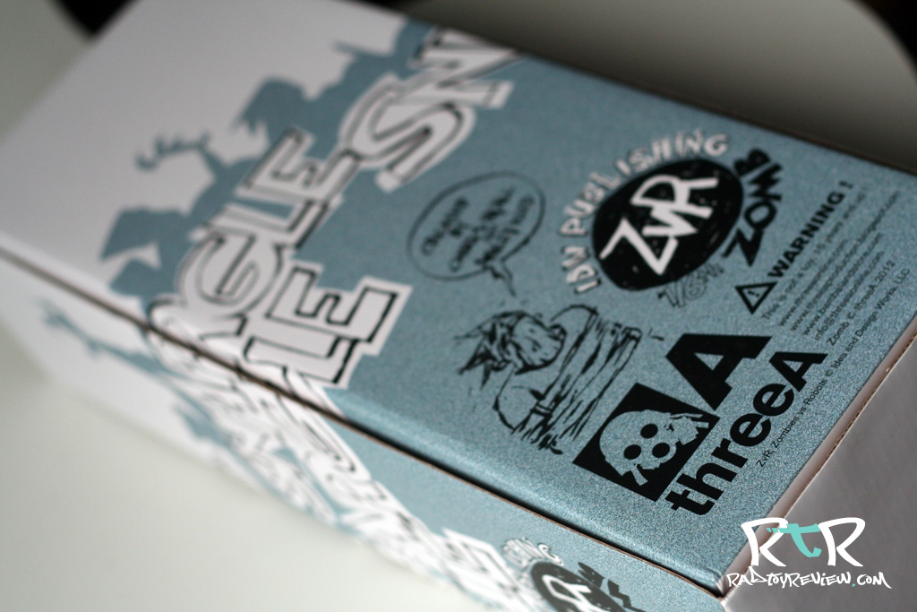
The 2 pack arrives in a sturdy, large brown box as is most often the case when 3A makes a house call. The box art itself is minimalistic front and back. It features contrasty red and white with various logos sprinkled about. It’s primarily a focus on basic form and negative space. Ergo, not a lot to see here.

WHAT’S INCLUDED

So you managed to wrestle your set free! Congrats! The big red bloke 003 has two sheathed (and sick looking) blades as well as holstered twin pistols. Darwin comes with a swap of hands and a tiny “wood” bertie. Also included is a catalog of sorts, showing offall the 3A toys you missed out on over the past year or so.

THE BREAKDOWN

My Grandma had a weird saying, “there’s those who dig graves and those who wouldn’t be caught dead doing such.” I think it was meant to be a funny way of looking at people who work hard and people who don’t… or it was just Grandma being morbid. Well, straight out of the box, Rothy looks like someone who wouldn’t be caught dead doing such. Super clean head to toe. Not a spec of 3A grime or gristle on him. Right after the Rothchild drop, 3A teased a few pics of a couple of Roth variants, an all black version and a dirtied up version that look like he’d been changing the oil on an old bronco. I know I said I was ready for clean.. but I can’t help but wish dirty mechanic Roth was a regular release as well.. I digress.

Rothchild has an interesting head sculpt. It’s extremely simple and expressionless. My first reaction to the teaser shots could be summed up with a massive “meh”. However, now that I actually have him in hand, I actually really like the sculpt. It works really well for the character. His youthful, blank stare somehow screams a dark ambition.. or perhaps contemplative resolve. He could just as well be saying, “you did well today my son.” or “I’m afraid I have to end you.” Maybe that’s why it works. It leaves a lot up to your interpretation in ways a sculpted smile, frown, smirk etc type of expression would not.

The hands Rothchild comes with are all slight variations of each other. One wider than the rest to easily hold the wooden Bertie and one in a sort of, arthritic, knuckled position which reminds me of Tommy Mission’s ham fists. The problem I have with the hands is they all look a little on the cheap side. Maybe it’s the total lack of weathering or paint detail but they look like they were simply cast and tossed in the box to ship. It’s odd because the hands ARE painted. Someone actually took the time to dip them or run a brush over them but there’s no details (fingernails, etc) at all. The sculpts are actually really cool, but in the end it comes across flat without different tones or highlights to set them off. Also, all of the hands in my set have very VERY visible seams which heavily contributed to their over all cheap-ish appearance. I did like that they’re made of a softer material than previous 3A figures have been equipped with. This is cool for fitting things into his hands with little effort, like a the wee Bertie or maybe even a weapon of some sort.

Speaking of the wee Bertie, it’s painted a sort of faux wood color. It does the job but is an obvious no frills effort at realism. Still, mini Berties are cool. It is known.

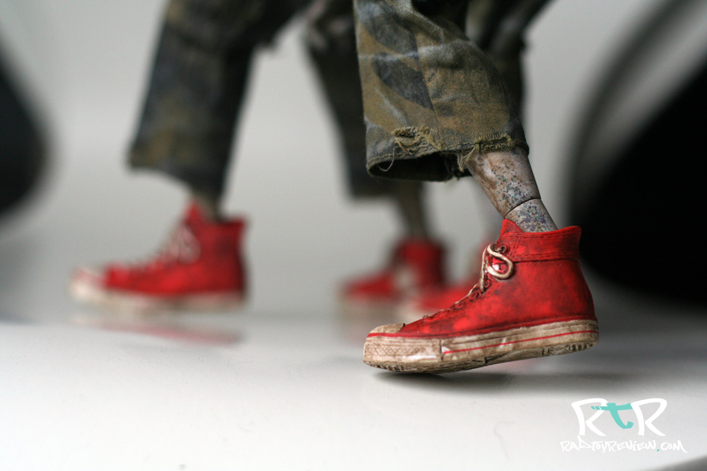
Roth has some Hot Topic-esque goth rubber boots that look kinda cool, if only from a distance. This was the one detail that I was the most interested in from the teaser pics. As it turns out, I found them sadly lacking. On one hand, due to the large sole of the shoes, you should have no problem getting Darwin to balance upright. On the other hand, thanks to the rubbery like material of them, they will not allow for any sustained ankle or foot articulation. Want to bend Roth’s foot up or down? Not a problem. Want it to stay there? Not going to happen. The ankle peg just isn’t stiff enough to resist the rubber of the boots. It’s odd, because even with Blind Cowboy and his incredibly hard boots I can get his ankles to bend and stay. I chalk it up to the nature of the rubbery material which is somehow neither soft nor hard enough to work.

Now we come to Rothchild’s wardrobe. This is where all my frustrations with this figure start to come to a boil. Roth features the newish 3A slim body which I’m a pretty big fan of. His clothes are sewn to be more fitted and “neat”, so therefore are more snug than most of 3A’s previous offerings. Ah.. frustration. Where to begin? The pants are nicely tailored but at the waist they sort of “U”up which gives him the look of someone who was on the unfortunate losing end of an all day brutal bout of Team Sport Wedgie. There is also no fastener of any kind where one’s zipper should normally be. Any sitting position you put Roth in parts the crotch of his pants wide open which neatly displays his Ken doll like goodies in true Basic Instinct fashion. It’s a strange omission considering the peeps in charge obviously have ample amounts of sturdy Velcro strips laying around.

Don’t get me started about the belt. I think I’ve seen a better looking accessory included with Beach Barbie. No seriously, her beach ball was super realistic! Well done Mattel, full marks! Anyway, the belt looks cheap, like a spare strip of pleather that was cut by a 10 year old. (Hmmm, these are made in China right?) The belt buckle isn’t doing much to help either. Overall, the whole get up is very cheap looking.

It’s Roth’s shirt that is the true bane of my toy collecting existence. Once again 3A decided to use a solid, wide, stiff strip of velcro, running chin to groin as the primary way of keeping his “button up” shut. As was the case with Blind Cowboy, this causes his shirt to bunch up in the front and sit stiffly. It’s impossible to get it to rest naturally. While BC shared this flaw in design, his shirt was at least loose and forgiving making it fairly easy to adjust with some determination. Rothchild’s shirt is form fitted to his slim body. There is no wiggle room here and no way to work around it. What you see is what you get.

On the plus side, the sleeves are fitted really nicely, giving you all the room you need to move his arms around. Unfortunately they’re buttoned (sewn) shut so there’s not a good way to roll them up if you felt so inclined.

Personal mileage may vary but in my case, just look at that mess of a tie. Crinkled, creased, and stuck in some degree of wind blown. The easiest thing for me to do would be to untie it, gently iron it and retie it. I’d do that, but 3A super glued the tie to his collar which has forced me to hunt down a tiny iron. The search continues.

We’ve talked about how Roth looks and dresses, but how does the man dance? Not too well it turns out. Thanks to the new slim body, Roth has a ton articulation at his disposal, you just can’t really access any of it on account of his unforgiving attire. Not that I expect too many will have him pulling off Van Damme split kicks or the like, but Roth’s cloths bind him up pretty well limiting his motion to about 40% of what it could be. Still, you may be surprised by how much character you can squeeze out of Roth, even when the majority of your poses will come from his arms and a twist of his neck. Anything beyond that is a royal pain.

So now we move on to Rothchild’s looming sidekick, 003. Man, how I wanted to love this guy. I’m a big fan of the clean, shiny Nightwatch colorway with my MK3 Bertie being among the favorites in my collection. Ash dirtied up Nightwatch and Daywatch when the Heavy Bramble versions hit and I lost interest. Then along came 001 and 002 Caesars, two paint jobs that mimicked the clean shiny look of DW and NW of old. While I didn’t pull the trigger on either of them (hindsight, they look amazing). I sprang on 003 believing fully that I’d be dealing with a glossy, beautifully clean, stark RED bot charged with rocking my entire collection with his awesomeness.

Let me start with what I like about 003.

At first glance, 003 is striking. He’s huge, towers over Rothchild and the red absolutely pops! The one armed shield looks awesome on him and all the black painted accents and white decals truly look fantastic. If you don’t like clean bots, he may not do anything for you. For me, I enjoy the variety of mixing the war-torn with the fresh off the factory floor.

The twin pistols and knives 003 look great. The guns have red grips while the knives have a really slick contrast to them. 3A calls the knife a “harmonic blade” and they knocked the design of it out of the park. I wish I could own one in 1:1 scale (Make it happen Ash!).  Some will mix and match, but for me the best look is dual anything.

Caesar has some really great articulation. I’m gigantically relieved of this. Up until now, the 1/6 dropcloths have sported the best bot articulation in the business with their ability to move incredibly similar to their 1/6 human counterparts. While not groundbreaking, Caesar does upgrade things in a few areas that makes them a tad more versatile. For one, the range of movement on their shoulders is a good deal broader thanks to a larger double ball joint. Caesar borrows from Popbot and puts a mid foot joint in for some more flexablity.

The last thing I noticed is the thumb joint is on a simple, nice to use ball joint that easily rotates around to whatever angle you please. You can also FINALLY lay the thumb almost completely flat against the palm of his hand. No more perma-thumbs up!

If I was to say one negative thing about “playing” with Caesars, it’d be that they’re a little big. Negative isn’t really the term I’m looking for, but unlike the Dropcloth who ring in just at 12 inches tall, Caesar hits the high notes of 16. The difference is pretty dramatic really. DCs you can grab off the shelf and mess with while leaning back, ‘laxing on the couch. Caesars are just bulky enough that you need something to sit them on to do the same thing comfortably. I think the recently released 1/12 Caesars may hit that sweet spot for 3A and give us something really special toy wise.

Still, given the relatively small amount of articulation limitations Caesars possess, you’ll definitely enjoy posing these guys up.

Aaaaand, that’s it. We’ve reached the end of the positive stuff. On to the gooey bits!

Someone else on one of the many forums I frequent said it best a day before I’d even had a chance to open up my set. I paraphrase, “003 is the first toy I’ve bought from 3A that actually LOOKS like a toy, like plastic.”

There it is in a nut shell. The promise of a glossy, sleek  and sexy red killing machine fell just short of sexy, sleek and (mostly) glossy. Let me remind you that I’ve collected the Night Watch colorway for a few years now. I’m used to 3A’s “clean” bots. I want to reassure you that “clean” is a non-issue here. The issue lies in how the red color of 003 reads.

003’s shield, arms, hands, legs and feet are all painted a nice shiny red color. In direct and indirect light, they maintain a dark but bright red hue that’s nice and shiny. However, there is something about 003’s torso and head that just screams “plastic”. At first, I wasn’t even sure if they were painted red or if it was simply exposed red vinyl. Upon further inspection I noticed a  few paint drips and tiny paint bumps here and there. I believe the problem lies in the material underneath. Where the arms, legs and shield are all a hard plastic, the torso and head are a softer vinyl. This allows light to penetrate the surface, even with a few coats of paint on it. Working in 3D I liken this to subsurface scattering which has everything to do with the absorption and affect of light to a surface. You can see it best in the wax of a burning candle or when there’s light shining behind someones ears or finger tips. This effect keeps 003’s torso from maintaining the same true rich red the rest of his body has which  To my eye, that’s where the illusion of this robot fails.

It’s difficult to photograph, but in hand it’s almost immediately apparent. I’m not sure if I can really blame 3A for this, but I can say that it doesn’t affect the 001/NW or 002/DW colorways. Maybe a better base coat? A few more layers of paint? Perhaps simply a darker, deeper, more crimson red should have been used. I don’t know, but I believe there’s some basic light affect/color theory at work here that should have been tackled on the factory floor before sent out to doorsteps.

The thing is, the oddness with the vinyl-esque look isn’t the part that bothers me the most. Tis his skirt and packs that doth pain me most. In a flat light, florescent bulbed office, the colors all blend fairly seamlessly. The reds hold hands nicely and play hop scotch when no one’s looking. Change the lighting though and wow, that skirt looks ORANGE! Again, difficult to photograph but if you held a red pantone chip up to 003 you’d find that each part of him is just slightly off each other. It’s no more apparent than it is on his packs. I have zero doubts that 3A struggled with trying to get this stuff matched up and it’s definitly close. But it’s a little like seeing a realistic CG face, we’ll call it the uncanny valley of color. When something’s off, even a little, it looks REALLY freaking off.

I make no claims to be a master of dyeing cloth or paint techniques in producing vinyl/plastic so I can’t offer a solution. That’s the beauty about writing a review. It gives you the means to go against the very core of constructive critism. More often than not I can toss out a reason why something is “wrong” without any half way solid ideas on how to get it “right”. I feel I’m guilty of that at this very moment and I wish I could provide a few nuggets that may steer the wayward 3A toy development person on to new and improved practices. I’ve none.

The last bit that’s more of a 3A “leftover” from previous toys than anything new to Caesar is the use of WHITE velcro. So many other toy companies use velcro as a cost saving way to fasten things together, but often it’s either cut smaller than the surrounding material or colored to match as to blend in better. The white velcro peaking out of every pack around his belt cheapens the overall appearance even more. If red was impossible to hunt down, black would have at least looked better. I hope 3A looks into some other velcro options down the line since they seem to LOVE using it whenever they can.

I wouldn’t necessarily call 003’s execution “sloppy” but definitely disappointing. Perhaps my expectations were simply too high. Given the hype and excitement surrounding this release, I don’t know what else to call it.

FINAL WORD

What’s confusing to me about this set is that at first blush it was to be all about neat and clean perfection. Caesars are of 3A’s LUX line and Rothchild is the pinnacle character of Ashley Wood’s World War Robot. Their designs are spot free, simple and by all accounts should hold up to some form of white glove treatment.

Instead, we find so much is swept under the rug or rather, appear rushed. While 003’s mismatched red hues and sometimes visually orange skirt are certainly less than awesome, it’s Rothchild that truly disappoints. Ill fitted clothing further handicapped by a big stiff velcro strip running up the front of his shirt are the tip of his poorly designed iceberg. In my case, I lucked out with one featuring a wrinkled and crooked mess of a tie to boot. His black kicks are basically stubborn rubber goth rain boots that at once allow for tons of ankle movement yet zero ankle poses. A tease letting you know that if they were better designed, you’d be able to do SO much more. In a show of minimalistic fashion mindedness, his belt matches his boots well. Too bad said belt is the cheapest looking accessory I’ve ever seen on a 3A toy. For once, I think 3A should take a few notes from Hot Toys and learn how to properly taylor some clothing. 3A needs to step up if they want to hold up.

If it sounds like I’m being overly negative.. I may be. I have to stress how much I was anticipating this set. I braced myself for some sort of understated, clean elegance when it came to Rothchild and his looming twin blade bearing red beast of a bot.  Darwin’s face sculpt pulled me in much more than I expected. But a great minimalistic head sculpt doesn’t hold up when the rest is such a so close yet so far shamble. I’m honestly a little shocked how 3A could pass him on with a straight face and stiff upper lip as if to say “this is the best we can do.” One would expect more of a forced smile and a weak missed-the-palm-only-got-the-fingers hand shake followed by a brief, “yeeeah, about that…”

I don’t really know what to do with this set. I’m looking at it now from across the room and the two look really good together. But they’re.. Way. Over. There. It’s when you get up close, wet-works style that the illusion vanishes and the flaws leap out at you like a spider monkey.

If you bought this set, I’d really like to hear your thoughts. Maybe I’m too sensitive to it, expecting too much. This set could be 3A’s triple decker burrito to my collection’s glutton free digestive system. While the end result for me is something akin to diarrhea, it may not bother you in the least, in fact you may find it amazingly tasty. I really want to know.

As it stands, Darwin Rothchild Father and Son Two Pack is one of the few and definitely the biggest let downs I’ve experienced from 3A. I hate when things turn out this way.. I guess even more the reason to cry out when they do.

Pros:

  • Rothchild’s simplistic head sculpt has something very cool, yet subtle going on that I really dig.
  • Caesars in general have great articulation and are very versatile and fun to pose
  • The twin knives are simply beast
  • General layout of the color and decal design on 003 is nice
  • Mini Berties are cool
  • (File this under, “not sure it counts”) From a distance, they look great as a set. Maybe you have a high shelf to put them on… ?

Cons:

  • Rothchild’s terribly stiff (thanks to that stupidly massive strip of velcro) and unforgiving shirt
  • Rothchild’s incredibly cheap looking belt
  • Rothchild’s skin tight pants that also happen to be sans a much needed zipper
  • Rothchild’s cheapo looking hands with very visible seams
  • Rothchild’s rubber goth boots. Not bad to look at, but not much use either.
  • Ugh, white velcro on everything
  • 003 has some very uneven red hues going on
  • he’s also overly toy or plastic/vinyl looking
  • 003’s skirt and bags change from red to vaguely orange in various lights
  • slapdash wood paint job on min bertie
  • This is LUX?

Help us improve this site by letting us know what you think! Follow us on Facebook and Twitter to stay updated on all the latest reviews, previews and toy news!

/

/

/

/

/

/

/

/