*REVIEW* 3A RVHK Tomorrow King

INTRO

It’s been awhile since I’ve been so excited about getting a figure dropped on my doorstep. 3A’s ReVenture Hong Kong 2012 show held host of quite a few exclusives that only those lucky enough to attend the show could get their greedy little mits on. That is, until the remaining tiny allotment was released on bambaland.com about a week after the show wrapped. I was at a friends house, enjoying a cold beverage and some freshly made salsa when the sale went live. I logged into bamba and waited for the first tid bits to load. I knew it was going to be chaos trying to score ANYTHING and that most likely the thing I wanted most (an Old Guard) would also be the most impossibel to get. Exclusives began to trickle onto bambaland.. so far, no Old Gaurd. Each hit of f5 was another spinning beach ball of 5 minute limbo. Finally, the TK box art popped up. I speedily clicked “add to cart” only to be forced into pumping my brakes hard, treated with yet another loading screen some 8 minutes in length. “Come on, come on, come on.. big money.. BIG money.” I’m sure I was muttering something along those lines. Suddenly the message on the screen caused my heart to sink into my shoes. A “server error, server too busy try again later” screen popped up. Knowing how crazy people would be to score one oof these excluves, I knew it was over, that I’d lost out. I failed to score a Tomorrow King.

Just before I closed my screen, I noticed the URL address still read as if it was on my cart page. I decided to hit refresh instead of the back button to see what would happen. After what seemed yet another eternity of waiting, my cart screen loaded up with the stubborn TK still inside! Stunned, I quickly hit the pay/checkout button and watched with delight as my order processed.

Now he’s finally here, my Old Guard. My Tomorrow King.

PACKAGING

What TK worth his salt hasn’t come in a lovely illustrated box? OG is no different. The front is splashed with a dynamic AW painting with a color coded dot on the top to indicate whether you received the blue, black, red or yellow TK. I got red. On the back has something ripped from Ash’s sketchbook with kitty purring the word “Exclusive” in bold letters! Yup, it’s legit!

WHAT’S INCLUDED

I was hoping for a poster, but I’ll settle on just getting the figure. Sigh. 😉

Brass tax. You get your TK and his single trusty sword.

THE BREAKDOWN

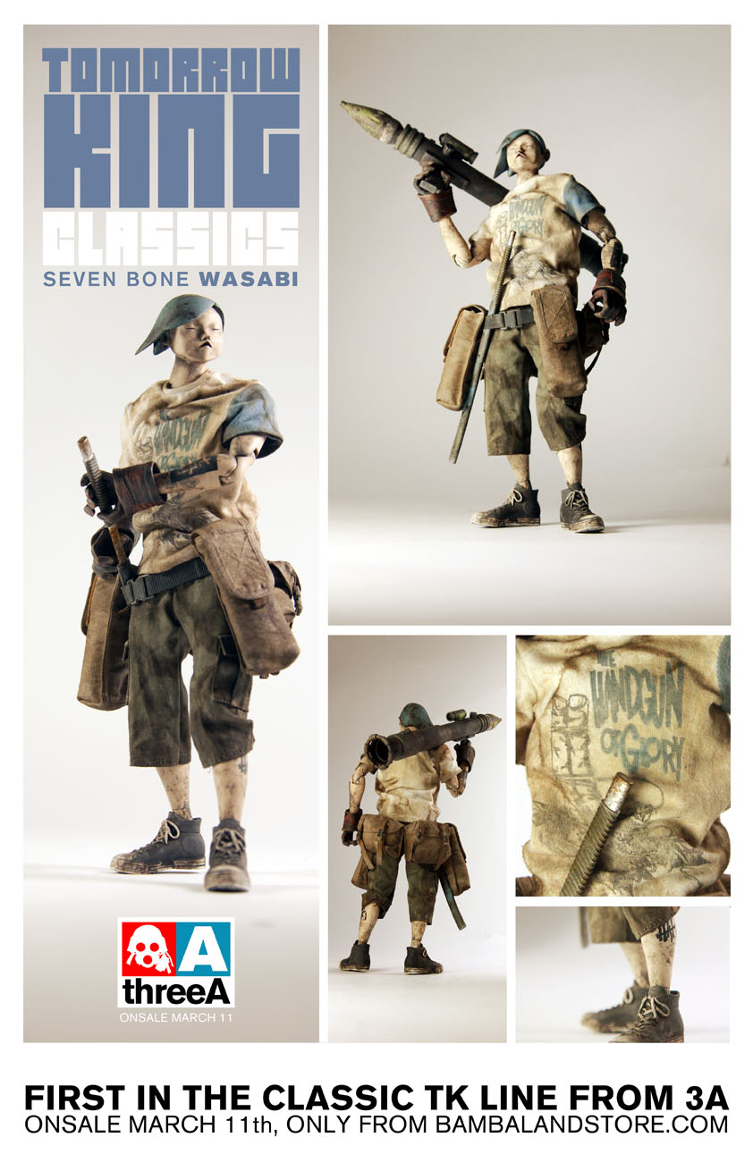
3A’s Tomorrow King isn’t anything new. Many 3A collectors have at least one in their collection tucked away somewhere. There’s the Oyabun, Heavy TK, 7 Bones and Interloper to name the few. There hasn’t been much description of exactly how the Old Guard truly fit into Popbot lore (the storyline Tomorrow Kings originate from). The original Tomorrow Kings are often referred to as the “OGs” (Original Gangsta’s), so it’s fitting that “OG” in this case stands for Old Guard. It’s a nod to the original Tomorrow Kings that are so cherished and desired by 3A collectors the world over. Given the relative difficulty scoring these guys, that desire is likely not to diminish despite their new car smell.

There’s a definitive simple elegance that’s just shy perfection in the design of the Tomorrow King figures. It’s something most people who don’t collect or own one won’t pick up on. Heck, I didn’t really get it until earlier last year when 3A released (and shipped) the first of their 7 Bones TKs, Wasabi. With their clean, not overly fussy design and punk rock meets japanese ninja ethos, I don’t find it all that shocking that many think the TK is THE perfect action figure.

So while I assume the Old Guard is a return to that simple elegance of the original Tomorrow Kings, 3A didn’t simply sew up a new batch of shirts and send these guys on their way. The Old Guard actually has an all new body (One shared by the forthcoming/currently landing on doorsteps, Rothchild). Most noticeable is his slimmer silhouette with narrow shoulders. I’ve read some refer to it as the kid or teenager body. One even called it the Bieber body. I laughed at that. Here you can see standing side by side with Wasabi just how much of a visual difference it makes.

You can also see from the same pic that Old Guard’s tee is much more fitted than Wasabi’s.  I can’t say which I prefer as they both work well for the characters. I may give a slight edge to the new body as it seems to work better visually with the lean, mean fighting machines that TKs are suppose to be. But I like the look of variety between them!

The tee shirt itself is what some may feel is a smidge “porny” while others will claim it simply “art”.. whatever you want to call it.. it’s an image of some sort of visually decapitated women in panties and bandages with her boob hanging out. Honestly, of the four Old Guards it’s not my favorite. I like the red color a lot, but find the design on the black and yellow to be much more in tune with my personal style.

Visually, my RVHK score is a slam dunk. I love the orange hair and red shirt. The paint is nice, clothes run or snag free. The new slim profile looks fantastic. Head to toe, I’m digging the orange headed Bieber. So what else do we have here to mess with? Ah yes, articulation!

At first blush, it’d be easy to believe that the articulation is the same as it’s ever been. Knees and elbows are double jointed, wrist spin and twist (a little loosely for my taste). His torso bends in various places and his ankles have those love them or hate them double ball joints. The hands are the same sculpts we’ve seen for years on Tomorrow Kings. One hand molded for gripping the sheath, the other a little tighter to handle the hilt of the sword. Nothing new there.

Or is there? As much as I think the new slim bodies really enhance the overall look of the Old Guard TKs, I did find one little hiccup in it’s execution. I’d even call it a step backwards. Due to the decrease in torso real-estate, the head/neck has less room to wiggle. The head/neck of the OG’s are not redesigned to compensate for the smaller area at the neck joint. What this has done is prevent as full of a range of movement side to side (ear to shoulder) as previously possible.

In the picture above I’ve pushed both heads sideways as far as they’ll go and I think it’s pretty clear how much of a difference that extra space makes. It was probably not worth the effort/expense to 3A to develop an entirely new neck post just for the Old Guards, but it IS kind of a shame it’s even an issue.  I guess we’re to believe these guys are warrior ninja’s capable of all sorts of insane giant robot crushing acrobatics and limber twisty turny ninja skill.. as long as they don’t have to crane their necks too far.

Maybe they are much older than they look?

Other than that, I only have a few small nagging complaints here and there. The first, I mentioned before is the incredibly loose wrist joints. My Wasabi has had the same helicopter wrists since day one, so it’s not exclusive to the Old Guard. I’m sure some will have a lucky die roll and get perfectly taught wrists that can manage whatever pose you twist them in. My OG needs physical therapy. The other “ugh” I muttered came when I first put his sword in his hand. I realized that the blue wash used to get into the creases of his gloves was still wet! The paint wiped off the sword fine and there was no noticeable smudging on the gloves themselves, but it’s still a nuisance. This isn’t baked goods, we’re don’t need our toys piping hot still smelling of the oven.. the paint should be dry/cured before it hits our hands. Kyuuketsuki anyone?

FINAL THOUGHTS

I’m all about Tomorrow Kings and am thrilled to have one from 3A’s Hong Kong ReVenture in my possession. Though not my first pick, (that would have gone to blue or black) red looks just fantastic. In fact, amongst the blue and neutral tones of my other TKs, he really stands out.

Posing and snapping shots of Tomorrow Kings is always a lot of fun. The strength of their character really blooms when you find the right light, angle and pose. Their faces are practically without expression but sculpted in such a way that they lend themselves to whatever type of mood it is within your imagery that you’re trying to capture.

I wish I could say, “Everyone should go out and buy one of these guys right now at your local Toy Store!” But you and everyone else knows that’s impossible. The ebay prices are silly.. stupid even. I’ve seen more than one of these OGs up for almost a grand. I find that hard to stomach, not only because it’s a freaking toy!! BUT some of the ACTUAL OG Tomorrow Kings aren’t fetching those kind of prices. Unfortunately, the flip factor for these guys is pretty high and ebay is evidence of that. Douche-McGee’s came out by the truckloads to Hong Kong to buy these guys just to flip for extortion level prices. Instead of supporting these layman of the avid toy collector’s bile ducts, reach out to your favorite toy community. Be patient. Something will come up eventually. I doubt you’ll get a hand out and I’m sure you’ll end up paying a good deal more than the 90 stones or whatever these guys were at retail, but I can almost promise you’ll get better results dealing with collectors community than the sultans of ass-hattery on ebay.

The more I’ve played with this guy the more I realize I’ll probably be right there with you, holding my breath, abiding my time and waiting for that WTS post. Daddy needs a black and blue. 🙂

Pros:

  • Classic Tomorrow King design.
  • Fantastic toy to play with and shoot photos of.
  • Great quality and care throughout
  • New slimmer body/silhouette looks fantastic
  • Box Art

Cons:

  • Slim body lessens neck articulation substantially
  • Loose wrists
  • Do to exclusive status, they’re being flipped like there’s no Tomorrow… King. (whamp whamp)

Help us improve this site by letting us know what you think! Follow us on Facebook and Twitter to stay updated!

.

.

.

.

.

.

.

.

THE WORKSHOP – MK 2.1 Square by Paul Benson

I’m happy to be able to bring you the step by step process of one of Paul’s most impressive custom projects yet, The MK 2.1 Square. I was blown away when I saw the finished piece and asked Paul if he’d mind putting something together for us to glean a little wisdom from. Grab your least favorite toy, an X-acto blade and some super glue and follow along!

Also, please don’t hurt yourself..

Enjoy!

– Knives

MK 2.1 Square
Although folks may not want to do a conversion like this one, hopefully the techniques I have used may help people to do their own thing. Certainly, by my reading of workshop articles on various websites and magazines, I have learned how to do things over the years.

So I wanted to tweak a MK 2 square into something that might be able to move faster and could be used for reconnaissance, intelligence gathering, spotting for snipers etc.  When in trouble, it could get out of there very quickly.  It would be capable of being out in the field for days and could withstand all weathers.  I toyed with the title of a Mk 2.1 Square.
I decided to buy a second JEA Mk 2 Square to work with, because (i) I wanted the converted square to be Joint Earth Army and (ii) the original would act as reference material for the custom build.  The aim would be to modify it by reducing the size of the head to reduce it’s weight allowing a better leg power to weight ratio.
Although I wanted to reduce the size of the head I still wanted to leave enough of the front to have all the facial features there and retain the full ball joint mechanism inside.  I reckoned I could reduce the width from 75 mm to 45 mm. I was not quite sure by how much I could reduce the height, because of how big the ball socket was, until I opened the head up.
Using a fine marker/pen I drew continuous lines around the head on either side of the face. This would be where the first two cuts would go.  With a hack saw I produced four main pieces that I will bond back together later.  I was only able to remove 10 mm from the height of the head.
The pieces needed to be tidied up with a Dremel and sandpaper before gluing them together.  I realised I may need to strengthen the new structure as I was not sure if the force need to turn the ball joint might break it open.  To do this I used pieces of balsa wood bonded inside with super glue, I then strengthened the joints quite crudely using a glue gun.
The sides were cut to size and then glued on.  Household filler was used to fill all the gaps and then sanded down.  The new dimensions of the head/body are width 45 mm, height 50 mm and length (of side) 70 mm compared to the original MK 2 Square which were, width 75 mm, height 60 mm and length (of side) which was the same.
The scope was made from Evergreen Scale Models strip styrene.  I used two sizes of square section strip to make the structure, one slightly smaller than the other, so that it could be made to pivot. The pivot is just a piece of circular rod styrene.  The eye piece came from my “bits box”.  The lens is just clear styrene sheet cut to size.  The scope was glued to the head before painting.  The eye ring and lens where left off until the Square was finished.  The eye ring was sprayed black.
The conversion was always going to be a JEA Square and by using a JEA MK 2 Square I could use a lot of the square without having to paint the entire thing e.g. the legs, face, fuel tank (I assume it’s a fuel tank), body below the head etc. I would have to paint the parts of the head that had been modified. For the base colour it is always a good idea to spray paint to get a good finish but I needed JEA green!  Not like it’s immediately available amongst the colours in model stores I’ve visited.  I did venture into the realms of using a spray gun a few years back, but the time spent cleaning it was very frustrating.
I therefore elected to use Citadel acrylic paints which I would apply with a broad paint brush to give as smooth a finish as possible.  I made up the JEA green with Citadel acrylic paints (available from Games Workshop stores and hobby shops).  After a bit of trial and error, I ended up mixing mainly Astronomican Grey, with a little bit of Fenris Grey and Snot Green (don’t blame me it was the names on the pots!!).  Other colours could probably be used. Just eyeball it.
Next, it was time to apply the insignia, of which there were only two different ones ‘JEA 80’ and ‘YUMIKO DIV’.  I photographed these on my original Mk 2 Square.  Using Photoshop, I reduced the two insignia in size to better fit the new head.   They were then tweaked using ‘brightness/contrast’, ‘desaturate’ and ‘invert’.  They were printed and cut out with a sharp scalpel. I did need to suspend some of the centres of certain letters by leaving a thin strip of paper acting as a bridge.  I also made a few mistakes, but corrected them with small pieces of masking tape.  Each stencil in turn was placed in position and stuck down with Tamiya masking tape, I used cling film to cover the rest of the square.  Just before spraying I noticed that edges were lifting around some of the letters and numbers. To correct this I used small pieces of Blu Tack, which while not perfect isn’t really a problem as the insignia on ThreeA toys are often broken up to simulate weathering.  I could correct the letters and number later if necessary with white paint.
To apply the insignia I used Humbrol acrylic matt white aerosol spray. Having applied one insignia I had to strip down the masking and apply the next.  I needed to use ‘JEA 80’ twice as it was on both sides of the head.
The next job was weathering.  ThreeA toys can vary in weathering and the second JEA Mk2 Square, which I converted, was more weathered than my original one.  They legs were certainly more brown, so I would have to weather the head and scope to match in with the legs.  Again, I would use Citadel acrylic paints.  I started by applying a thin wash of Dark Flesh (which is a reasonable mid rust colour) mixed with a little Chaos Black. The colour was blended into the white areas of the face.  During this early stage I painted on a ring of black around the eye.  I did this by cutting out a paper stencil, with two circles the inner one being held in place by thin strips of paper.  The stencil, cut to size, was then taped over the face and I then very carefully painted between the circles. When the stencil was removed, where the thin paper strip had been, was painted over.
The edges of the head and scope were stippled with small pieces of coarse sponge dipped in a mixture of Scorched Brown mixed with Chaos Black.  In parts the same was done with grey I mixed from Skull White and Chaos Black to represent paint chips and again with Blazing Orange mixed with a little Dark Flesh to represent rust spots.  A fine paint brush was also used with these three colours to refine and emphasize some of the stippling as well as to pick out the scratches and dents on the sides of the head.  The rust colour was used as wash to run into depressions and as trails from areas here rust might have gathered.
For finishing touches the inside of the scope was painted back and the lens and eye ring glued in place. I also added an eye lens after painting the eye black. I used a punch (see above picture) to cut out a 6 mm disc from shiny coloured plastic, bought as cheap folders for notes.  I got the punches on a well known online auction site, as set of sizes from 3 mm to 8mm, which work for other eye sockets I have used them for.  They will stay in place pretty well if you don’t want to risk permanent change to your 3A toy, but a touch of super glue on the edge will secure them even better.
Thanks for your interest in reading this article.
We hope you enjoyed the latest Workshop. Big thanks to Paul for once again putting this together for us. 
 We’d love to hear from you and check out what kind of customs you’re working on! Send us a shot of your latest custom work with a brief description to radtoyreview@gmail.com. 

Hit us up on Facebook or Twitter pages to stay updated whenever we post new Workshops and epic toy reviews!

Until next time!


Coming Soon!

Just a heads up! A few things planned to pop up over the next few days.

Play Arts Kai’s Metal Gear Solid Snake and Cyborg Ninja reviews!

– New Indie Toy Artist Spotlight Interview with Alison Perez!

New Workshop by the amazingly talented Paul Benson!

– Facebook contest rules etc have finally been sorted.. We will post them very shortly here and there! “Like” us on Facebook to participate!

I also wanted to give a quick thanks to everyone who keeps coming back and picking up what we’re putting down over here! I can’t tell you how much we appreciate the love and support!

*review* 3A WWRp JEA Heavy Bramble

INTRO

It’s not often that I’m able to point my finger at previous review we’ve posted and say that the one you’re currently reading (enthralled with?) will be essentially a retread of the former.  Yes, it’s 3A WWRp JEA time again. The on-going saga of collecting the JEA colorway at 1/12th scale continues with the just released, retail WWRp JEA Heavy Bramble.

You might detect a few notes here from my previous review of the WWRp JEA MK3 Bertie. Many of the same things I admired and critiqued on that bot are essentially the same sort registered here. If you’ve yet to read it, I suggest you give it a gander after you’ve consumed this tasty meal. If you’ve had it before, then perhaps you’d enjoy a quick revisit.

So while there may be a few woodsy.. perhaps smokey hints that leap off the back of the palette a few moments after you’ve finished a sip. Fear not, there are differences below…

or perhaps just a few finer details.

PACKAGING

Ah yes. It’s good to see the likes of AW paints once again being the focus of a 3A toy’s boxart. WWRp Heavy Bramble features an image of the Bramble Gravedigger, I assume a few moments pre-rocket release, the icons/graphics are minimal, the painting prominent. Definitely worthy of shelf display.

On the back we get a nice quick background story about the Mk3 Bramble. While we’ve seen slivers of story here and there on various 3A packs, this is the first time I’ve seen one that features a bots proposed “specs”. Size, weight, height, it’s all here. It’s pretty cool in a geeky (aka, me) kind of way.

WHAT’S INCLUDED

Your Heavy Bramble will come packed tidy with 4 bags and a massive rocket launcher of sorts known as the Aunty Jack 4 Way RPD.  I think of it as 3A’s BFG.

THE BREAKDOWN

It’d be really super crazy easy for me to go down the path of drawing comparisons between little WWRp Heavy Bramble and big WWR Heavy Bramble. I could fill this page with how amazingly close to the two are in terms of paint, weathering, articulation, presence… etc.  On and on I could go until you’ve found yourself reading an exhaustive comparison of each bot’s pinky surface texture. I firmly believe that nobody wants that.

So I’m going to try not to do that gentle reader, because you deserve more. I’ll sum it up real quick and say that yes, indeed 1/6 and 1/12 HBs are practically identical twins, albeit with one wot’s been shrunken by some sort of wonderous toy shrink ray. The bags might be a shade or three lighter on the WWRp version. but beyond that… twinsies!

Instead, I’d like to focus on the WWRp Heavy Bramble and how he relates and compares to the other bots in the WWRp world.  The JEA colorway and otherwise.

Out of the box and at first rub, Mr. HB looks really good. The familiar greens, tans and icons that any JEA fan would appreciate are all here. I’m still amazed at how much detail 3A can squeeze onto their smaller figures. Especially when it’s based off a larger version and manages to remains faithful to it down to the tiny drips of “oil” running off an exhaust. I’m almost convinced that they reverse engineer everything. Simply design a robot for the small scale only to release the giant version first with the sole goal of really impressing us all later. Flecs of rust, soot and oil remind you that you’re looking at a machine.. a machine that’s been places and seen some things.

I love Heavy B’s proportions. The original bramble is one of my favorite toys out of 3A with it’s barrel chest (literally.. a barrel)and has always in my mind been the “muscle” of the squad. The HB takes that idea and runs with it. Just look at those gorilla arms. He makes poor Mk2 look absolutely anorexic by comparison. If I had one complaint with the design it’d be the extended exposed wrist joint. It functions as a tremendous boon when holding the launcher, but aesthetically it does look a little out of place.

Articulation on a Heavy Bramble is essentially the same as it was on the standard MK2 Bramble. The larger shoulders/arms do seem to have a slightly more limited allotment for shoulder movement, but I doubt it’s anything you’d notice or mind if you’re already a fan of the MK2. Other than that the head turns, waist twists, knees bend and fingers open/close. If you were able to get there with the Mk2, you shouldn’t have any issue doing so with the MK3 as well.

Of note is that all the joints (fingers included) on my Heavy Bramble were perfect. Not too tight, not too loose. Each had just the right amount of resistence so I can twist and turn him into whatever pose allowed and he’ll stay put. The fingers don’t flop around like loose erector set pieces, the arms or legs don’t feel as though they may snap in twain while bending them. It could be complete blind luck mine turned out this well, but I’ll take it. However, if by chance there’s a setting on the dremel tool or whatever piece of machinery 3A uses to engineer toy joints.. I’d like to whole heatedly request that they WRITE IT DOWN!

The addition of  MK3’s thicker arms makes a lot of sense given the size of the RPD he’s equipped with.

It’s huge. Massive even. End to end, almost twice the size of HB himself. I love the design of it with it’s flaps and scope. It’s a bit limiting how Heavy B can hold the launcher. Apparently Rothchild only designed these guys as rightys. The scope is stuck firm and fast on the weapon’s left side, meaning HB has to hold it with his right hand if he wants to hit his target. It’d been cool if the scope snapped on and off so you could move things around a bit more freely, but regardless the HB + launcher is an impressive and imposing sight.

Complaint time.

The side bags are just as annoying as they’ve ever been. I’m probably alone but I’m just not a fan. I’ve always liked the idea of bots sporting bags and you may think they’re the best thing since sliced bread. Just don’t be surprised to find that once again they fly off at the smallest bump as though possessed by a silent robot sack focused banshee. At this point in the evolution of robots/warfare and the men, women and children who play with them, there HAS to be a better way to adhere these things to robots.  Bring back the bertie belts! Those did the job with grande gusto! I know, I know.. adding belts at this juncture when the original 2 year old design didn’t have them would be some kind of toy design heresy. But I’d happily forgive that by chalking it up as an “upgrade”.

Also, the bag straps are all over the place. Untidy to say the least. That is all.

Throwing HB up with the rest of the JEA crew looks great. The cohesive colors and icons speckled throughout the gang looks really nice together. Heavy fits right in while not getting lost in the sea of greens. It could be that massive launcher he’s holding allowing him to stand out, but I’ll let him take the credit

HB’s design elements seem to borrow the most from the MK2 JEA Bramble and the JEA Large Martin. The general overall color scheme is basically swiped from MK2 while many of the updated icons are taken from LM. It’s a good blend I think to tie the squad in a bit more. Thankfully the tones are just right and not like the out of place (though individually cool) blue dominate JEA Armstrong. If having your bots match is important to you, the JEA Heavy Bramble shouldn’t dissapoint ya.

So other than the bags, a criticism arguably based off preference than on true unbiased observation, what other problems/errors/missteps/unforutnates did I find with Mr JEA HB? Well I’ll tell you.

I found two.

As a long time 3A collector my fondest memories go back to some if their earliest bots. These of course are the MK2 Brambles and the MK2 Berties. Not only were they brand new, never before seen highly articulated robots sporting awesome firepower and an intriguing background story, they were painted and detailed with such astonishing care and finesse. The first Bertie I held in my hands was Dirty Deeds. An all black bot with a few simple white icons on him. deceptively uncomplicated. But when you really looked at him the various layers of paint and weathering begin to pop out. As the different shades of bronze and silver rust along with the careful placement of painted wear and tear reveal themselves, you begin to realize that there’s nothing simple about this all black bot at all. In fact, it’s a masterpiece.

Perhaps that’s comparing apples to oranges. A bit too abstract. I’ll go another route. The obvious one. Bramble to Bramble. While they look great together, putting them side by side will no doubt show you very clearly why your brand new MK3 Heavy Bramble is and will always be inferior to your old, dusty, out of date MK2 Bramble. Big arms be damned.

Just look at the scratches of silver metal peaking through on the various ridges and edges on the MK2. Places where the Bramble had obviously scratched itself against something heavy, which took paint as it’s prize. It catches the light and breaks up the muck of oil and drab. To me it’s the one last crucial piece of the puzzle that sells the idea that this is a “metal” robot I’m looking at. The Heavy Bramble doesn’t have that. Without that small touch, the little breaks to his specular profile, he’s plastic.  Really cool looking plastic, but plastic all the same.

I’ve noticed this on the last several 3A bots I’ve collected and I can’t understand why they felt it no longer necessary to apply that level of detail to their new bots.  It’s as though 3A ran out of silver paint.

I understand they’re getting bigger as a company and the demand for 3A toys is unfathomably greater than it was when the MK2 was released, but hire another detail guy (gal) or two and please bring it back 3A!

My only other quibble with this miniaturized robotic giant isn’t a fault of him being WWRp, but fault of the original’s execution which this scale happens to mirror.

Those blasted launcher flaps.

If by some miracle 3A could have found it in their collective hearts to update the launcher to include HINGED launcher flaps, singing birds would have herald their greatness to the heavens, the sky would have turned a pure Bob Ross blue and Apollo would have lifted his skirt.

I might have even cried giant man tears of joy.

But alas, they did not so I did not. None of that stuff happened because they decided to leave them sticking out, thin and gorilla glued. Once more you will have to worry about how you lay the launcher down, placing it hanging over a ledge or if you fancy yourself a brave sou,l standing up right and balanced on end. You must examine daily the very grip of your Heavy Bramble to ensure that it be firm and true so the launcher does not fall foul from it’s fickle grasp.

Because if it DOES, you will without the slightest hint of question have a broken, busted, shattered launcher on your hands. You might as well buy a small tube of super glue the next time your at Walgreens just in case.

Oh, and keep it close.

FINAL SUMMARY

The MK3 WWRp Heavy Bramble is another fine addition to my JEA Squad. I was actually a bit more excited about getting him than I was my MK3 Bertie a few months ago. I just love that classic ol’ Bramble design. If you collect JEA or one of the other WWRp colorways offered by this retail run, I’d recommend scooping up one or two. Even if you don’t, their a steal right now and some great designs to choose from. There’s even some region specific variants for UK, USA and Asia that are only available if you live in the respective area.. or have that thing called internet and can type the word “ebay”. They’re available now at just about all the sexy cool online toy stores. Grab them while you can!

A few 3A purist may discount my claim that the paint on the HB lacks the refinement of the original MK2’s and assume that I’m simply trying to find something to complain about or critique. On the other hand, those who gather speed off 3A’s missteps will probably applaud and take my comments about the paint app to mean the Heavy MK3 “sucks”. Neither are true. Despite my lust for a return of 3A perfection and the few wanted improvements I’ve noted, these guys are really great toys.

I firmly believe that 3A is still delivering above and beyond 99% of anything else out there.. I’d just like to see them nudged back to 100%.

Pros:

  • Another great addition to the JEA squad or the WWRp collector’s shelf in general
  • Great articulation and perfect (at least on mine) joints.
  • Very nice paint that practically mirrors his big brother
  • Colors match the JEA squad flawlessly
  • Huge launcher is BA

Cons:

  • When side by side with MK2 Bramble, the lack of some of the finer attention to details in the paint application on the Heavy are really noticeable
  • Flaps on the launcher are still glued on and fragile.

Help us improve this site by letting us know what you think! Follow us on Facebook and Twitter to stay updated on all the latest reviews, previews and toy news!